Holganix
A clearer path from soil biology to the benefits people care about.
- When
- 2025
- Role
- UX architecture, wireframes and interaction design
- Team
- With LUDWIG+; final visual design by a collaborating designer
- Output
- Website flows, R0 to R5 wireframes and interaction intent
- Live
- holganix.com
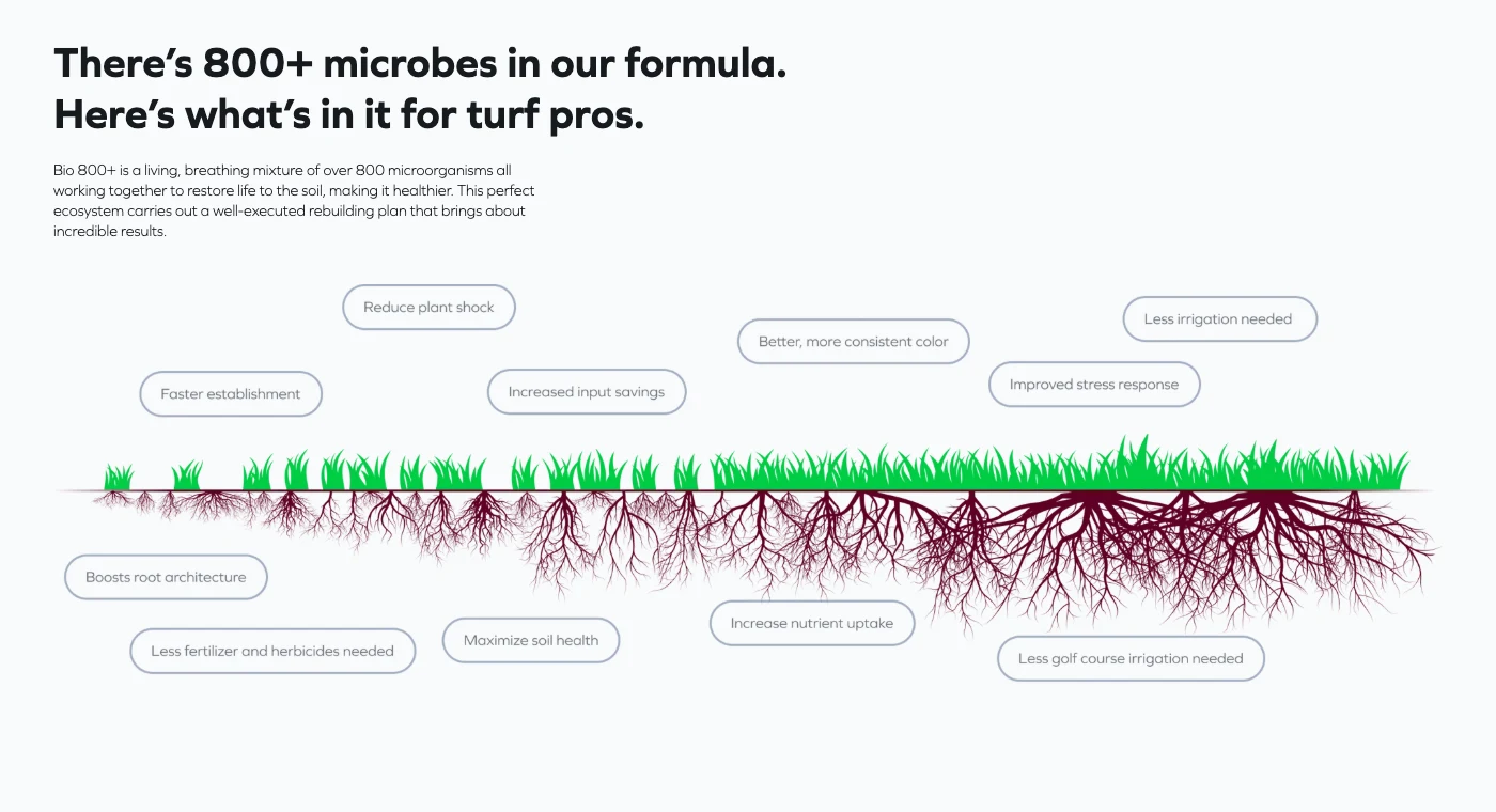
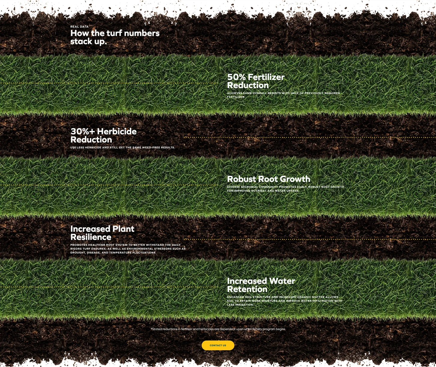
RecordedThe implemented Turf page retains the growing roots and surrounding benefit labels. Final visual design by a collaborating designer. Captured September 9, 2026. Product claims belong to Holganix.
- Historical
- made during the project and shown as it was
- Recorded
- captured from a real product or process on a stated date
One company.
Different reasons to care.
The visible change is in the order of the argument: a visitor first gets a reason to care, then a path into the information relevant to them.
Holganix works with soil biology, but visitors arrive with different questions. A farmer considering crop performance and a turf professional maintaining a landscape need distinct routes into the same underlying product story.
My work was to shape those routes: what a visitor encounters first, how the explanation develops, and when to move from the shared story into information specific to their work.
I developed the UX architecture, wireframes and interaction direction. A collaborating designer created the final visual design. The implemented website shown here is the result of that collaboration.
01 · Audience flows
Begin with the visitor's route.
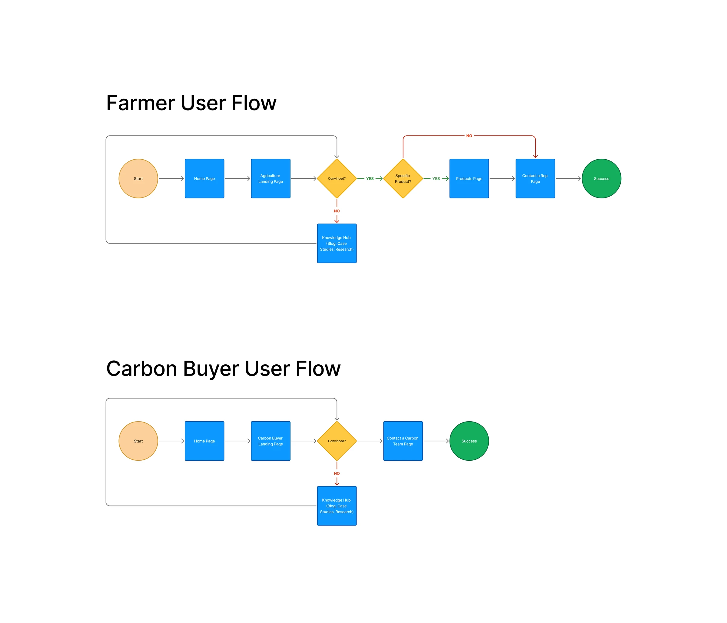
Before laying out individual pages, I mapped the paths through the site. The flow work established how visitors could enter through an audience, learn about the product and process, find supporting stories, and reach the next useful action.
The homepage needed to connect those paths without trying to answer every audience's questions at once. Audience pages could then go deeper into the benefits, evidence and practical information relevant to a particular visitor.
02 · R0 to R1
R0 gave me a direction to reconsider.
The initial R0 direction was less successful. Client feedback on R0 was that its sections bled together and lacked cohesion: the page needed more distinction from section to section and a clearer visual hierarchy.
I returned to the page structure, explored alternatives in sketches, and developed a new wireframe sequence. That reset is part of the work, not a step to skip over.
R0 led with “Grow Possible,” two immediate audience choices, and a grid of six benefits. R1 kept the headline but changed what followed: a video-led introduction, the problem of damaged soil, an hourglass explanation, and a closer look at the microorganisms. The audience routes arrived after that shared explanation, so a visitor gets a way to understand the product before choosing a path.
R0
Initial direction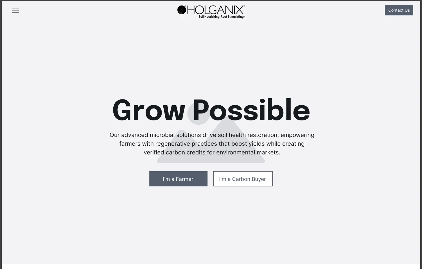
R1
Reworked sequence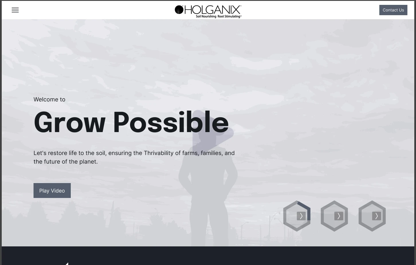
03 · Sketch to website
Follow one idea through the revisions.
The Turf page provides a direct thread from the original drawing to the implemented website. In the sketch, a strip of growing roots gives the soil story a visual structure. Notes around it explore benefit cards and how they could reveal more information.
R1 turns that drawing into a wireframe section. R5 keeps the root-growth illustration and makes the surrounding benefits more specific. On the implemented page, the same arrangement is visible in the finished colors, typography and illustration treatment.
Not every sketched interaction or section had to survive. The value of the sketch was that it made the relationships concrete enough to discuss and revise before the final visual design.
Compare the four Turf stages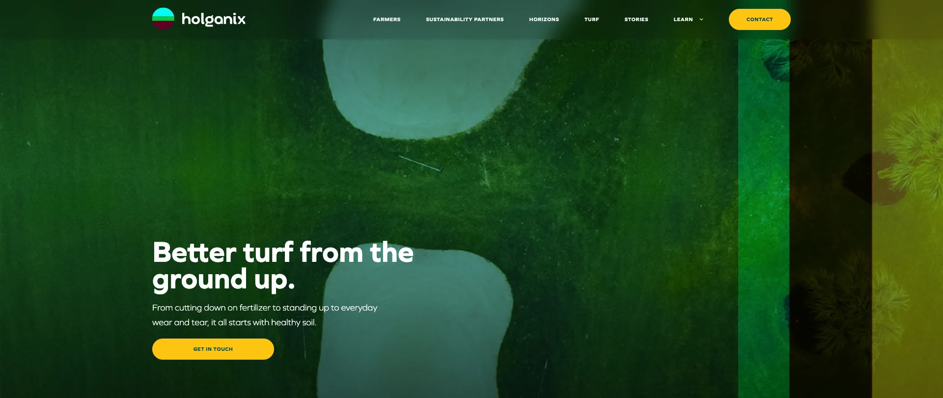
04 · The homepage
Give the explanation something to hold onto.
The revisions continued from R1 through R5. The later homepage combines several kinds of explanation: an introductory film, soil restoration, a close look at microorganisms, audience routes, the Living Network and testimonials.
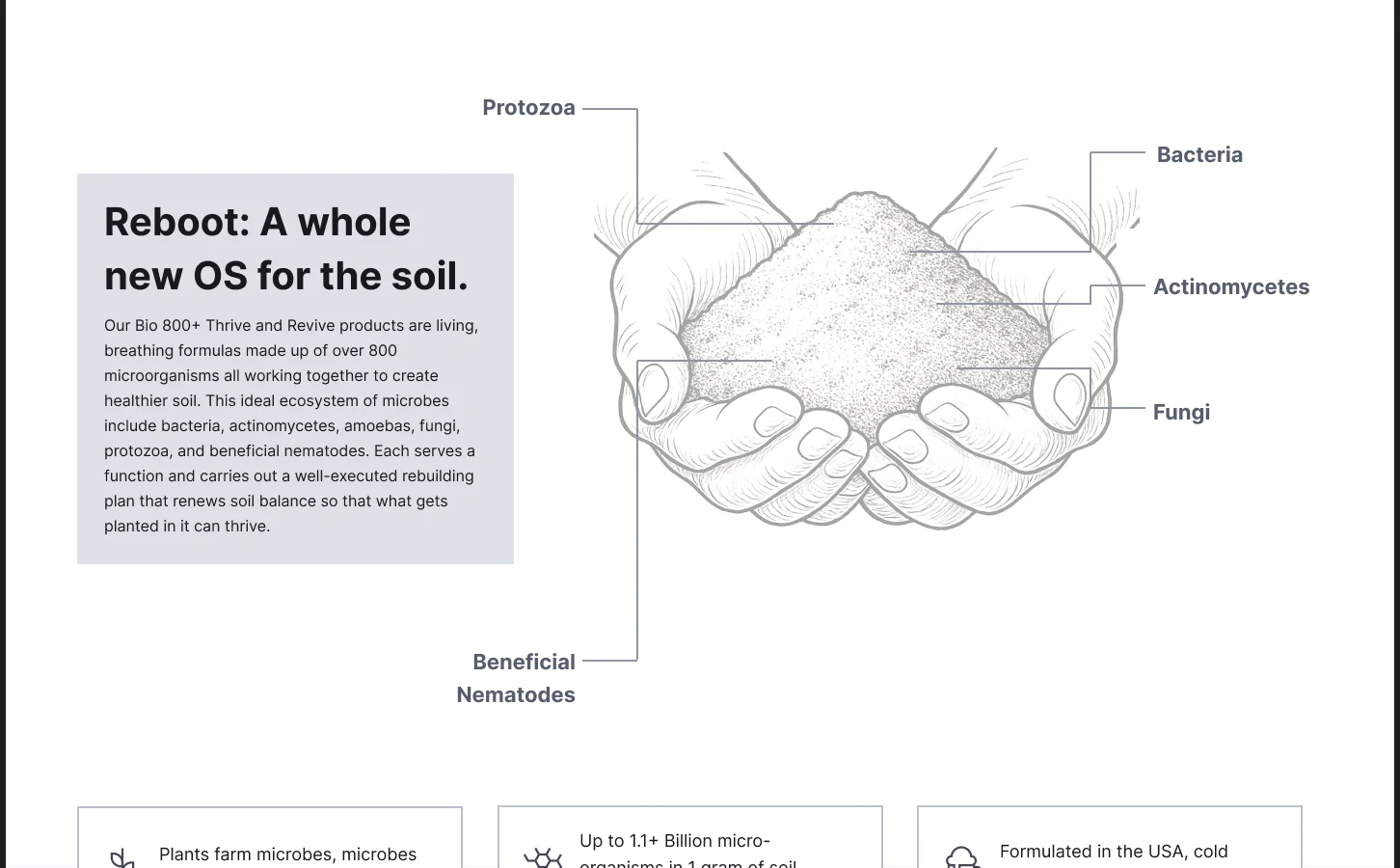
For the microorganism section, the wireframe pairs a handful of soil with labels and a short explanation. It connects an unfamiliar biological process to something tangible. The implemented website develops that direction through photography and scrolling behavior.
This is where the distinction between my contribution and the visual designer's work matters. I established the content relationships and interaction intent; the finished visual expression came through the collaboration.
05 · Interaction
One hourglass.
A changing explanation.
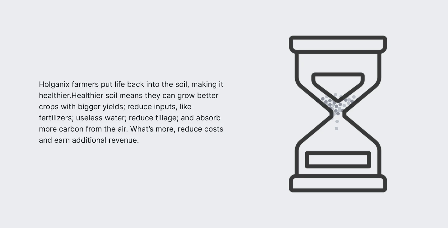
The R5 homepage uses one visual anchor while the message changes. The real website carries that idea into a scrolling sequence, with the hourglass, particles and backgrounds responding as the visitor moves through the story.
Watch the implemented sequence.
RecordedFrom the live website · 20 secondsAn uninterrupted recording of the real homepage, captured September 9, 2026. The viewport is cropped around the interaction; playback runs at the recorded speed. Final visual design by a collaborating designer. Use the video controls to play, pause or seek.
06 · Farmer journey
Put the audience's evidence closer to the start.
The audience work continued beyond the homepage. In R0, the agriculture page moves from a product introduction into a three-step process, performance metrics and an ROI calculator before reaching farmer stories and product choices.
R5 leads with a farmer case study and testimonials, then develops the story through more examples, data, and product rates and application guidance. The revised sequence brings other farmers' experience nearer to the beginning and keeps practical detail available for a visitor ready to go further.
These artifacts show the wireframe decisions at those rounds. The live farmer page has continued to evolve, including Farm Possible and ROI content, so the case study does not treat every later product choice as a direct copy of R5.
R0
Page opening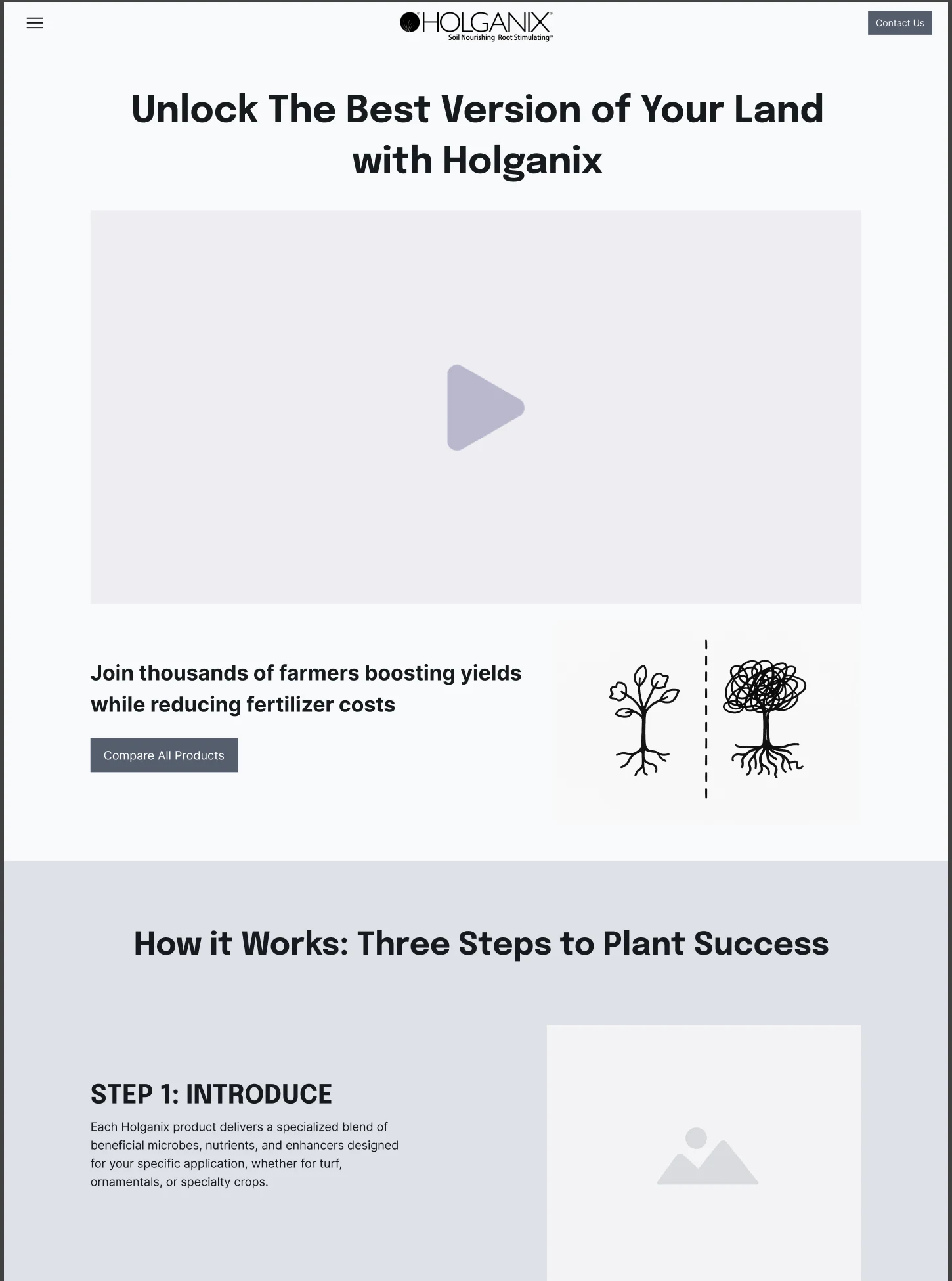
R5
Page opening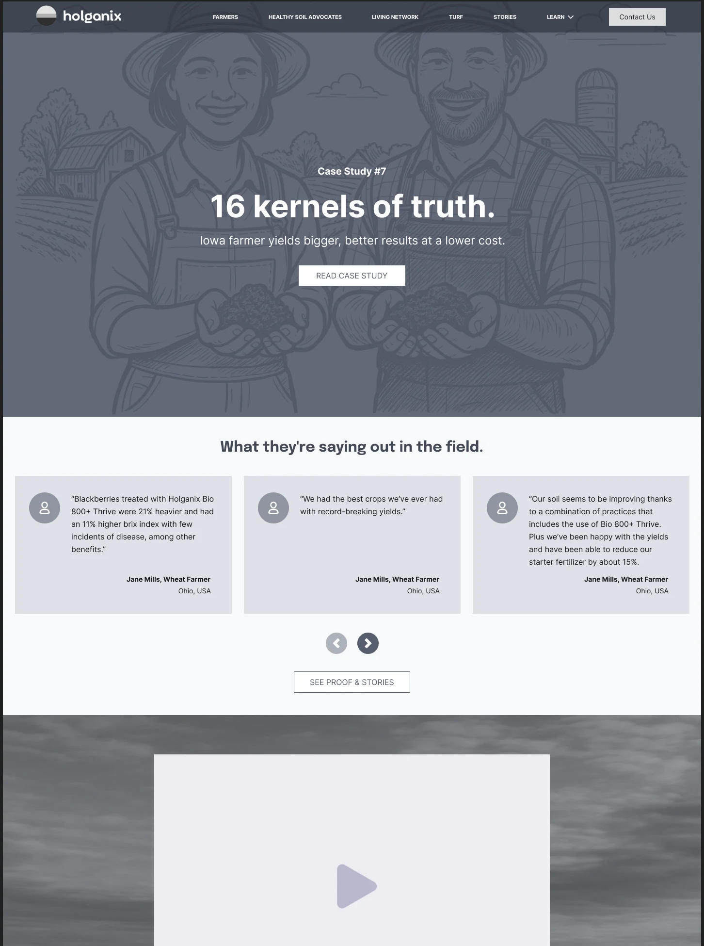
07 · Handoff
A structure the visual design could build on.
The finished Turf benefits section makes that handoff visible. Alternating rows, the sequence of claims and a repeated connection across the page were present in the wireframes. The live design gives those relationships a physical texture through grass, soil, color and typography.
The project changed course after its first direction. Working back through sketches and wireframes made the visitor journeys, content hierarchy and interaction ideas more resolved, and created a clearer foundation for the final design.