YIMBY+
From Journalism Tool to $50K ARR SaaS Platform
How I built urban intelligence software through AI-powered data visualization - and grew it across three cities
Role: Co-founder, Chief Product Officer
Timeline: December 2021 - Present (3+ years)
Stack: Unity, React, Node.js, Mapbox GL, OpenAI API
At a Glance
A comprehensive urban analytics platform that transforms 2,000+ Chicago YIMBY articles into interactive 3D visualizations. YIMBY+ aggregates development data from permits, articles, and official records, rendering every project in explorable 3D with 20 customizable data layers tracking temporal evolution across decades.

THE PROBLEM I WAS SOLVING
Since 2020, I've written over 2,000 articles for Chicago YIMBY, covering a wide range of construction projects in the city. Each article included renderings, specs, and status updates. But as the number of projects grew, a fundamental problem emerged:
How do you understand the cumulative impact of hundreds of developments scattered across a city? How do you see patterns in what's being built, where, and by whom?
Traditional maps showed dots on a screen. I needed to see the skyline itself - in three dimensions, filterable by any attribute, explorable across time.
So I built it.
Chicago, Miami, New York
Subscription revenue at $40/month
Projects tracked with full regulatory data
THE SOLUTION
A comprehensive urban analytics platform that:
- Aggregates data from articles, permits, and official records
- Uses AI to extract structured information from unstructured text
- Renders everything in interactive 3D with 20 customizable data layers
- Tracks temporal evolution from 1960 to 2033
- Provides stakeholder intelligence (developers, architects, contractors)
What started as screenshots in my articles became a revenue-generating SaaS platform serving real estate professionals, urban planners, and policy advocates across three major U.S. cities.
THE SPARK
IT STARTED WITH DAILY WRITING
In 2020, I began writing for Chicago YIMBY - an online publication covering construction and development news. Every single day, I'd publish articles about new proposals, approvals, groundbreakings, and completions.
The routine was consistent: research the project, gather renderings, document the specs (height, units, architect, developer), write the story, publish.
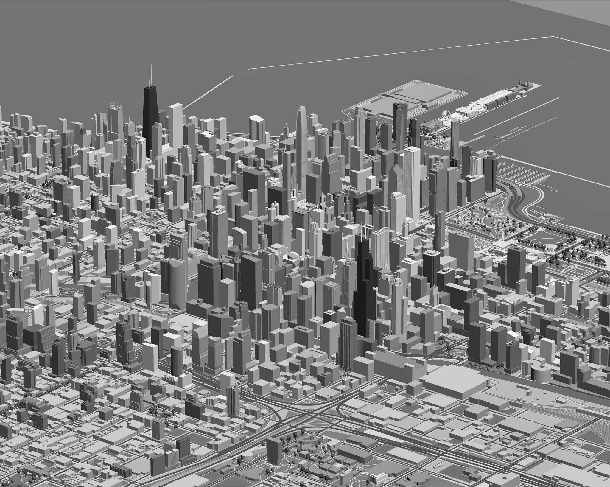
After hundreds of articles, I noticed something: I was building a comprehensive dataset about Chicago's development pipeline, but I had no way to visualize it spatially. Where were all these towers in relation to each other? How would the skyline look when they were all built?
Google Maps showed dots. I needed to see the actual buildings.
So in December 2021, I started building a 3D model in Unity.

Daily articles like this one created the need for spatial visualization
THE DECEMBER COUNTDOWN
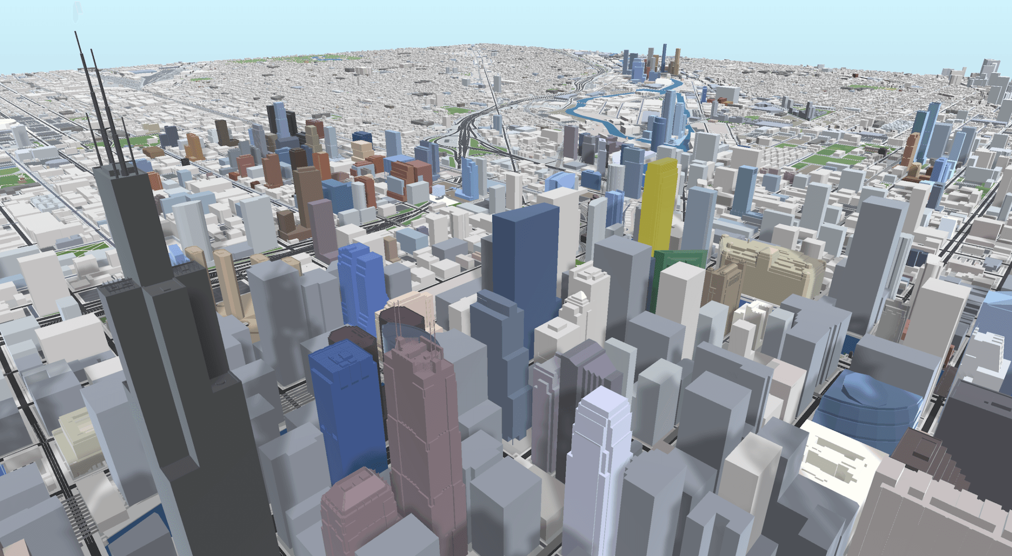
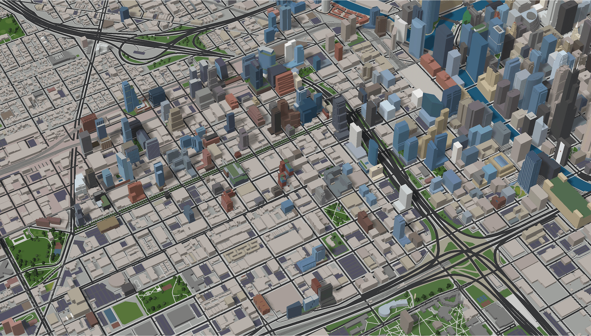
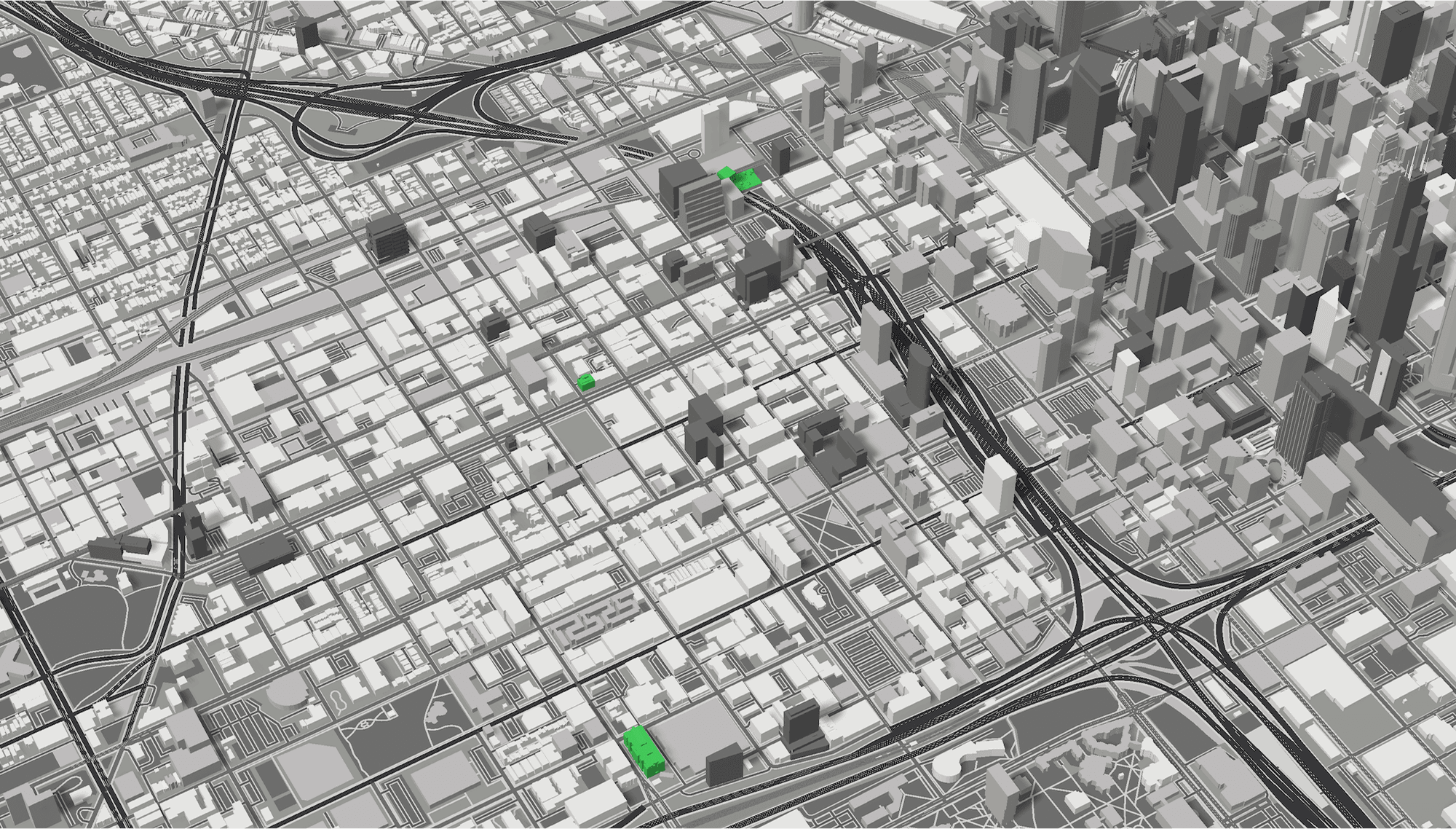
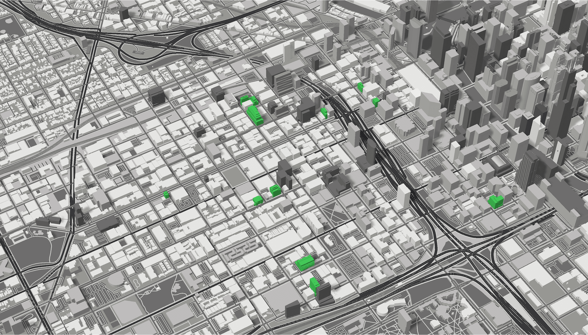
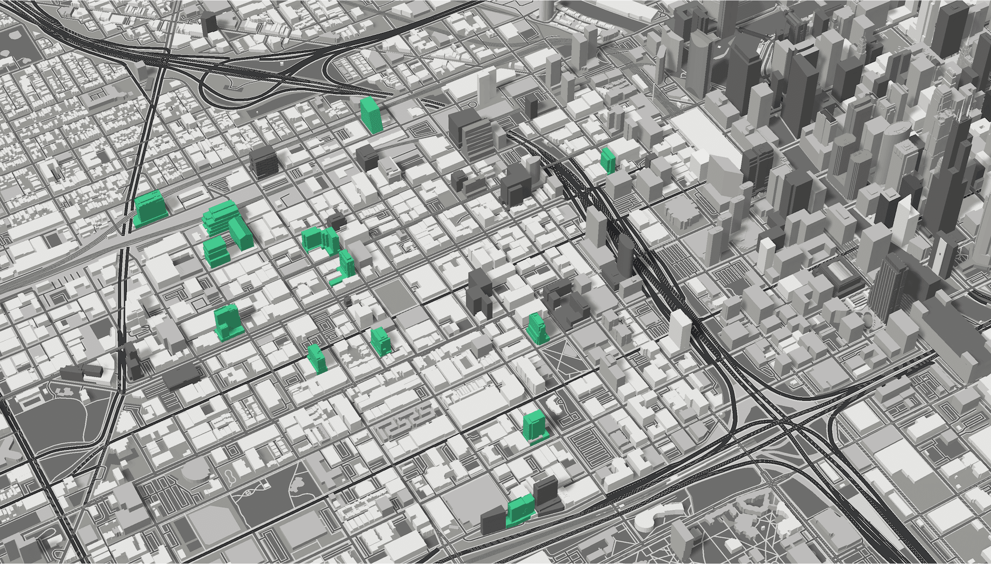
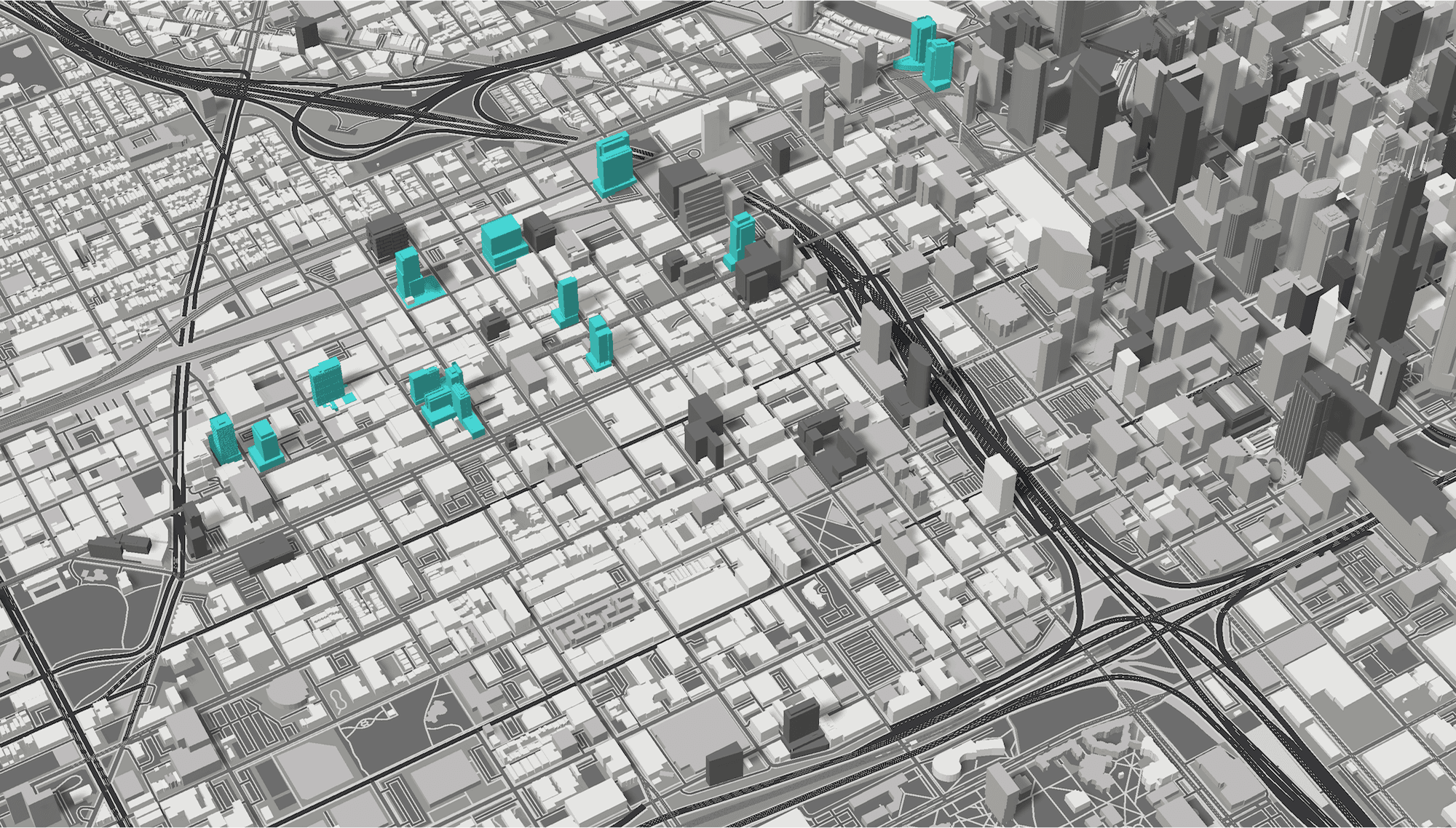
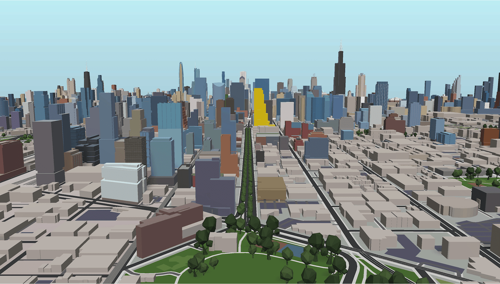
Every year, Chicago YIMBY publishes a countdown of the tallest projects under construction. In 2021, I had an idea: what if I built all of them in 3D and revealed one per day?
I spent the month adding each tower to a downloaded base model of Chicago in Unity. Every article included screenshots showing that day's project (highlighted in cyan) among all the previously revealed towers (shown in green), set against a grayscale Chicago basemap.
The response was immediate. Readers loved seeing spatial relationships - how the new towers compared to existing landmarks, where clusters were forming, what the skyline would look like when everything was complete.
This was validation that spatial context matters when understanding urban development.
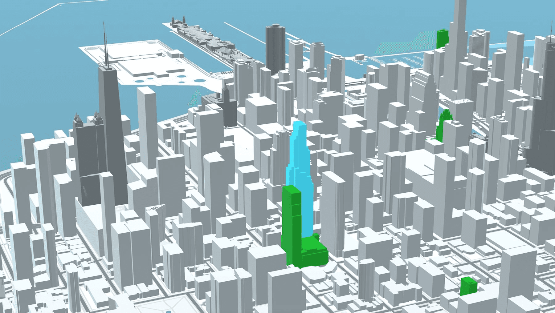
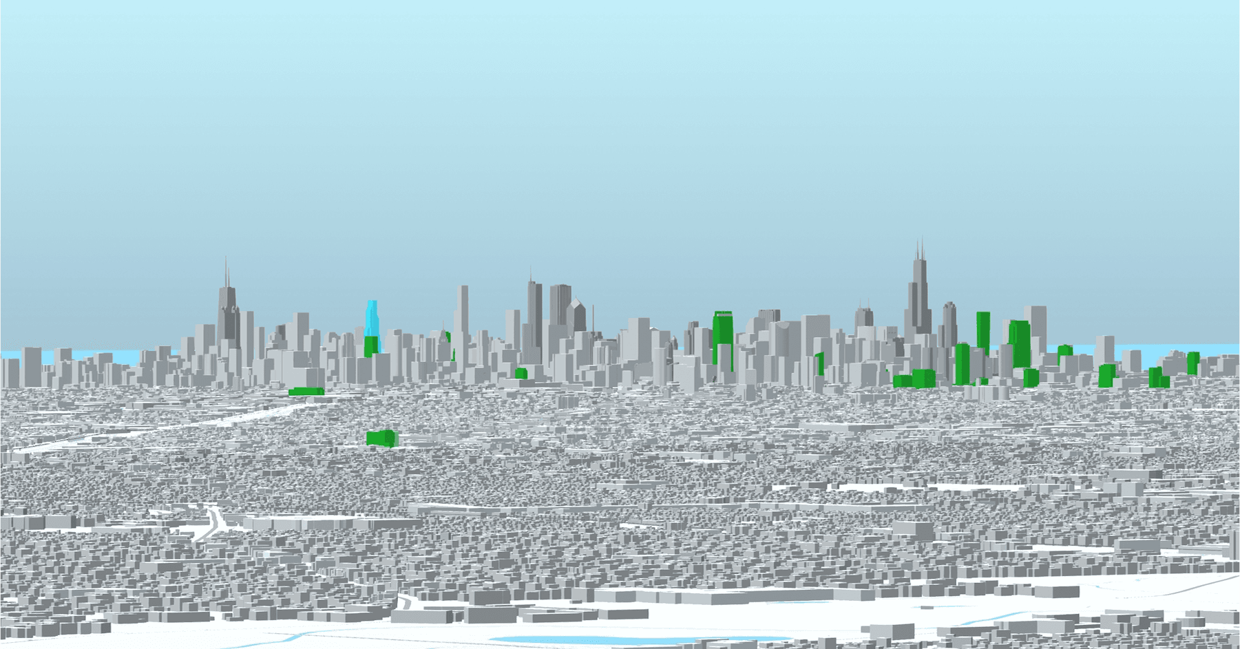
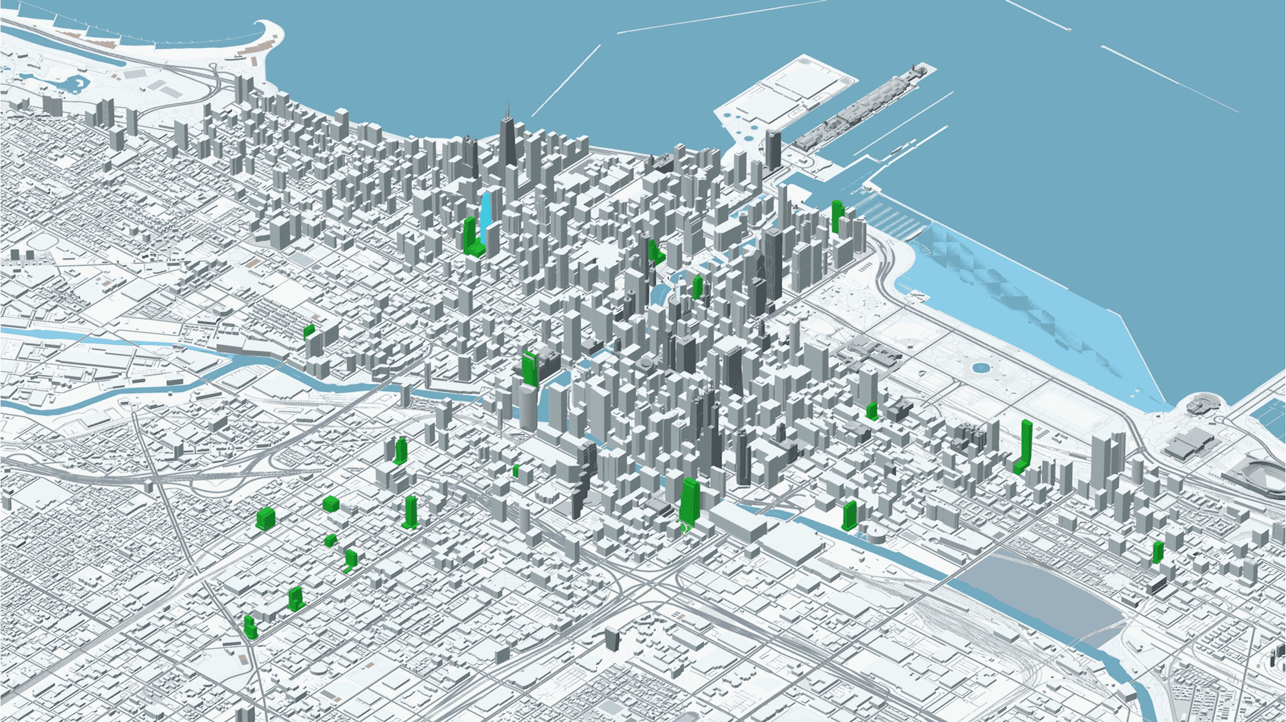
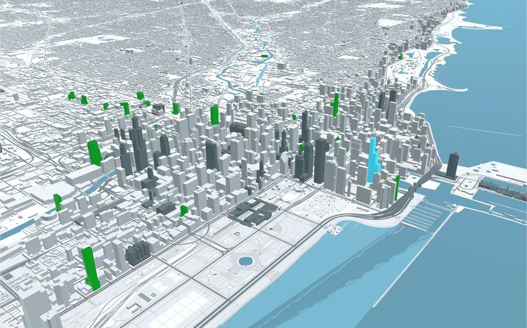
Daily reveals during December 2021 countdown. Each day's featured tower highlighted in cyan against grayscale cityscape.
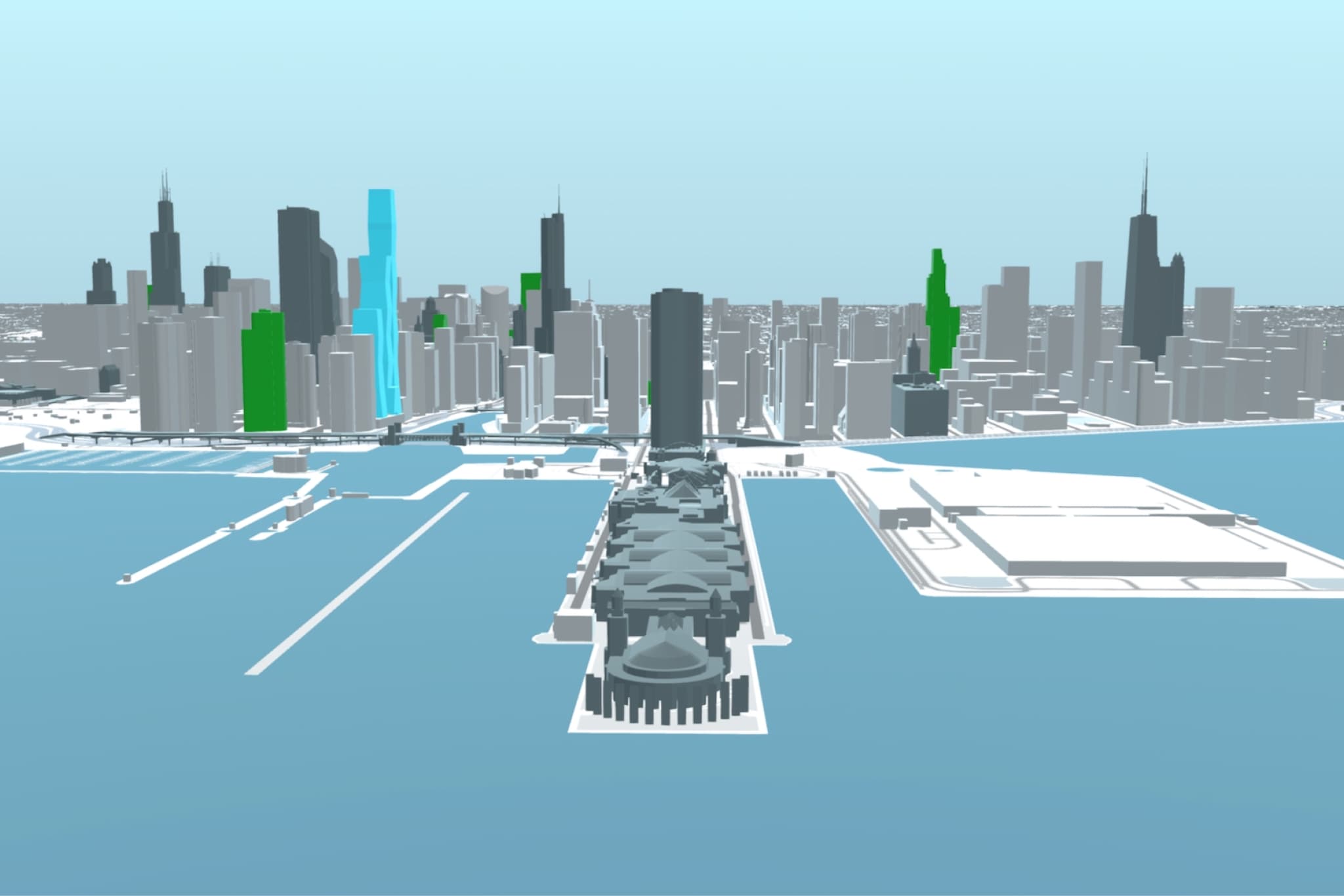

Model accuracy validated against actual drone photography. Same camera angle, lighting conditions, and building positions.
KEY INSIGHT
The positive reader response was the signal I needed. This could be more than a one-time countdown gimmick. What if it was a persistent, queryable platform?
FROM STATIC TO DYNAMIC
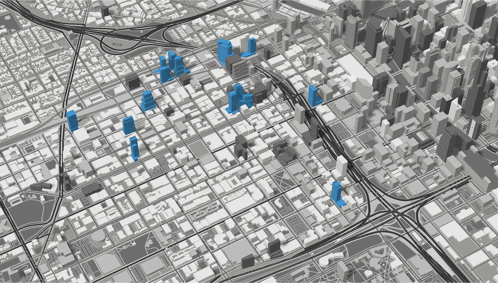
The December countdown worked, but it was limited - one view, one color scheme, one story. To make this truly useful, I needed multiple perspectives on the same data.
I experimented with different classification schemes:
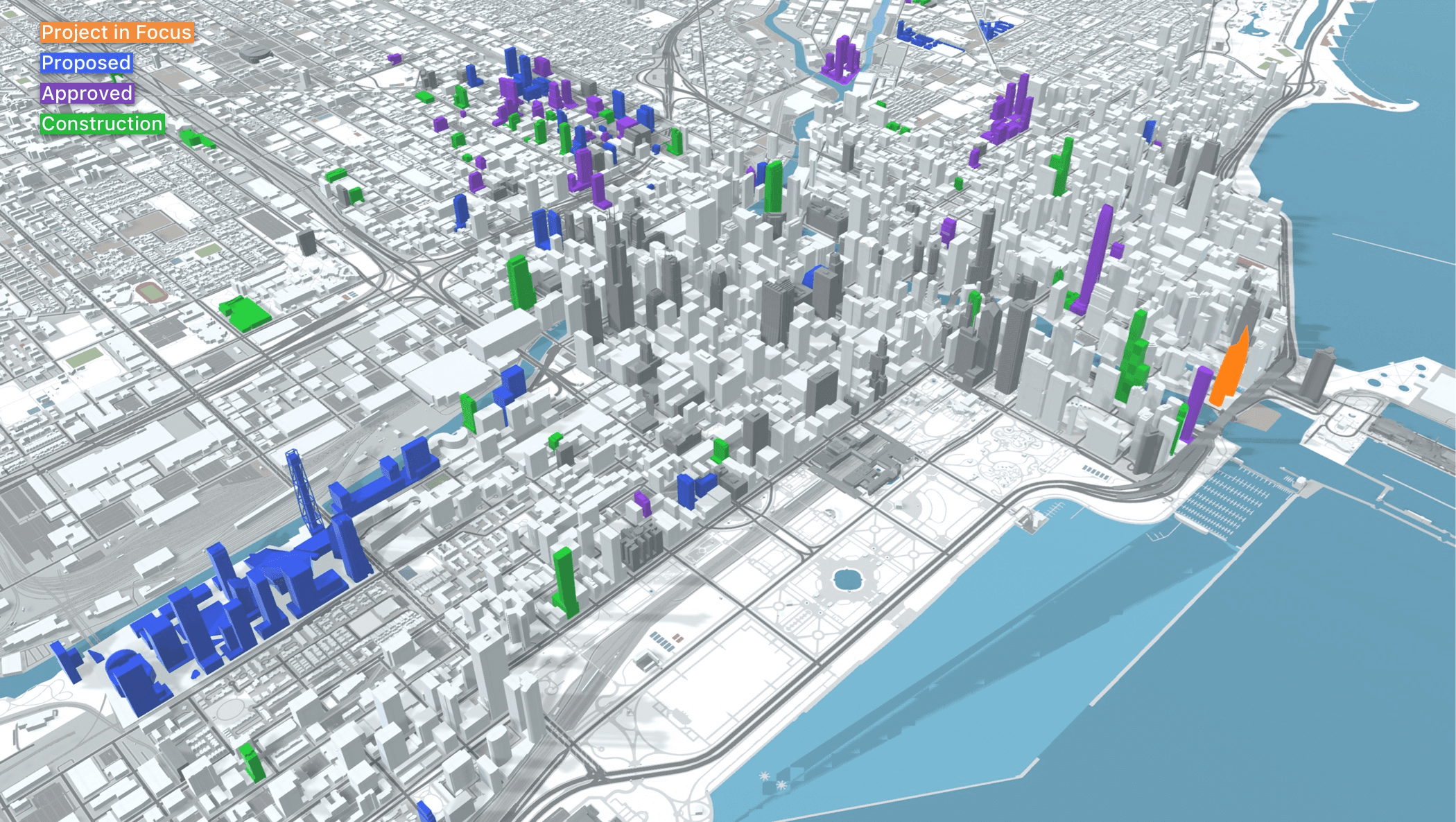
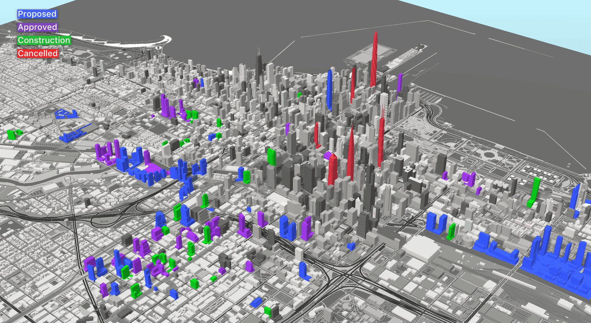
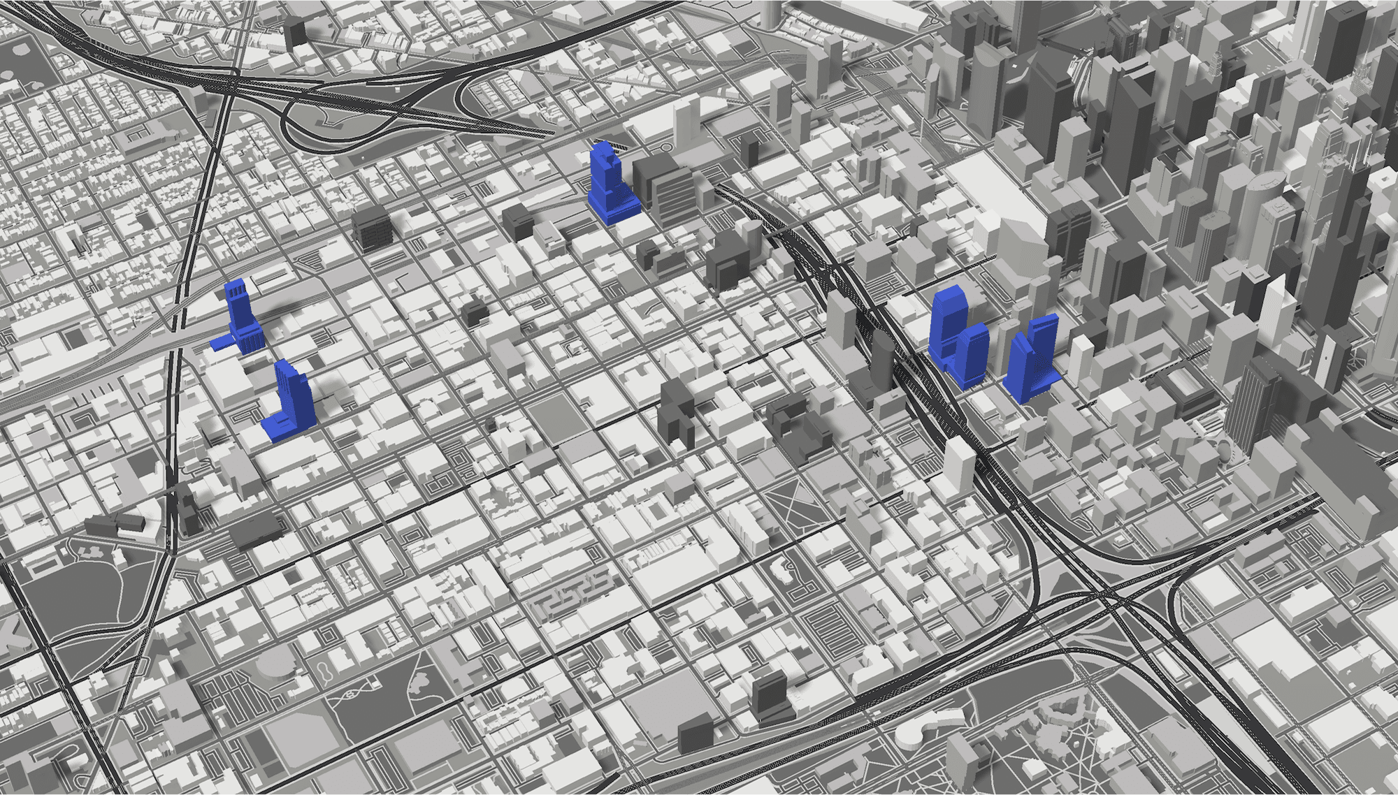
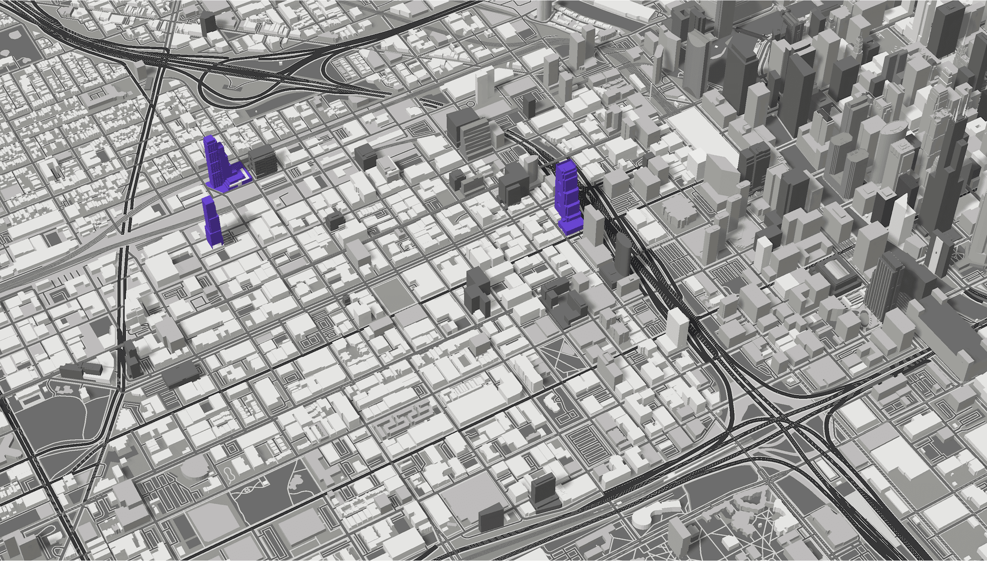
PROJECT STATUS
- Blue = Proposed
- Purple = Approved
- Green = Under Construction
- Orange = Article Focus
BUILDING FUNCTION
- Purple = Mixed-Use
- Magenta = Office
- Orange = Residential
- Yellow = Other
- Blue = Article Focus
The goal was to answer different questions with the same spatial data:
- "Where is construction most active?" → Status view
- "What building types dominate this neighborhood?" → Function view
This required rethinking the entire color system and building a data architecture that could support multiple classification layers simultaneously.
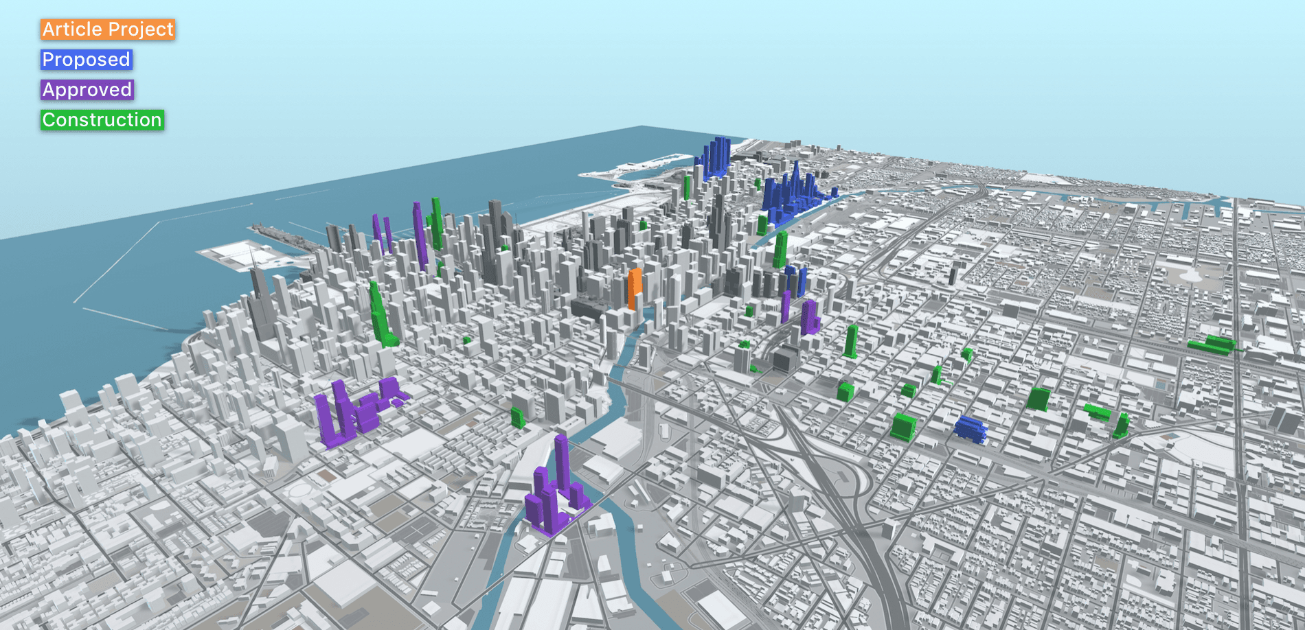
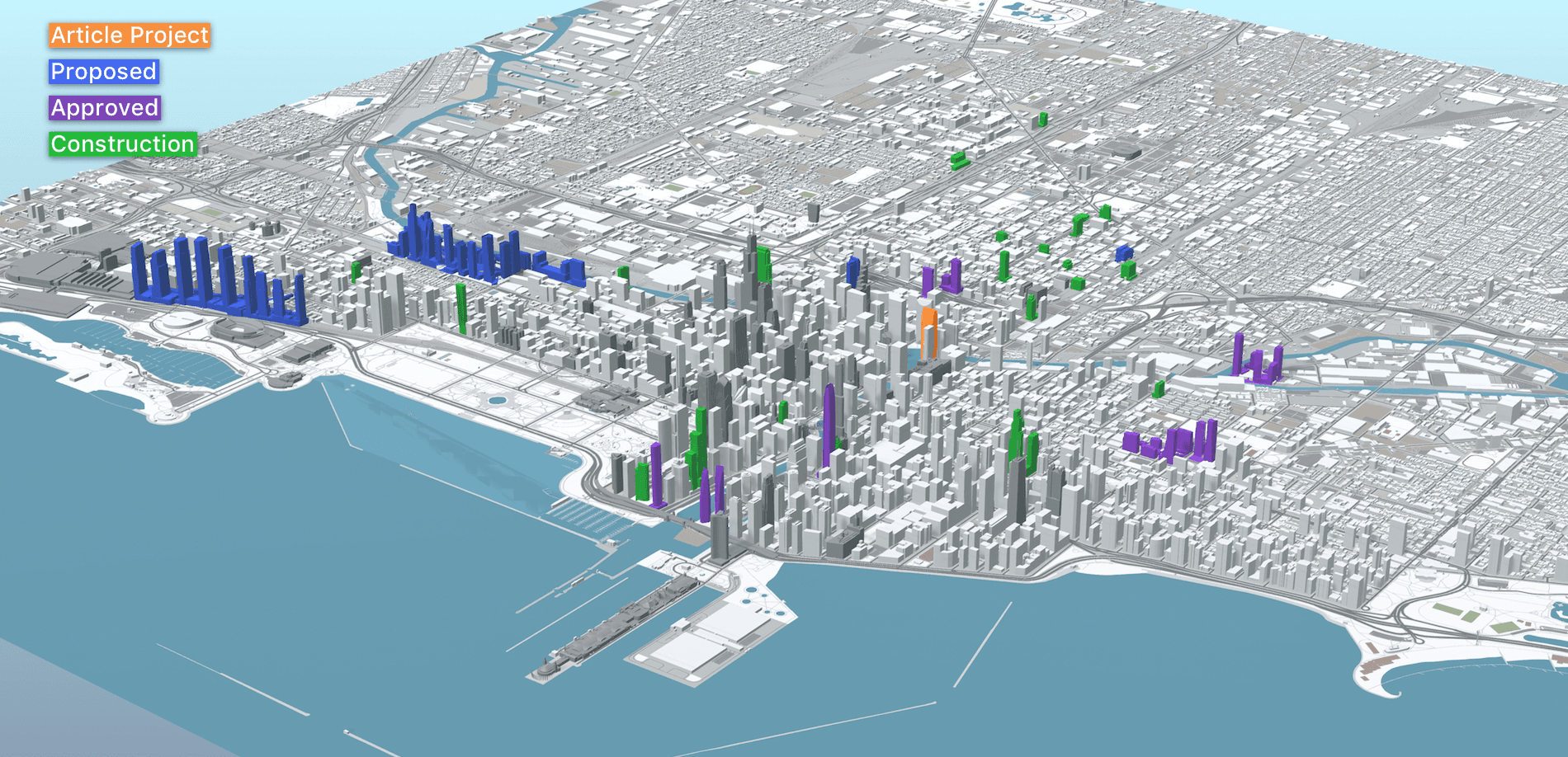
Orange (focus) + Blue (proposed) + Purple (approved) + Green (construction) became the standard palette.
Downtown Aerial
Set 1 of 2
DESIGN DECISION: COLOR AS DATA
Each color had to be:
- Distinct enough to differentiate at a glance
- Meaningful (green = go/construction, blue = proposed/early)
- Accessible (colorblind-friendly combinations)
- Aesthetically coherent as a palette
The lighting and rendering also improved during this phase - I started darkening major landmarks and refining shadow systems to make the colored towers pop.
KEY INSIGHT
Having multiple data layers was the foundation of the entire platform. The same dataset viewed through different lenses reveals different patterns. This concept would evolve into 20 layers as the platform matured.
JAKOB'S LAW IN PRACTICE
I had a hypothesis: people who grew up playing SimCity would intuitively understand this interface. But my early models looked clinical - like data diagrams rather than explorable environments.
Jakob's Law states that users prefer interfaces that work like things they already know. I needed to bridge the gap between analytical tool and familiar experience.
The solution: make it look like a game.
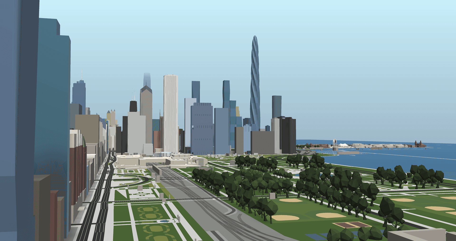
Natural building colors instead of status indicators. Realistic textures suggesting glass, concrete, brick. Environmental context - parks, water, infrastructure. Camera angles that balanced verticality with spatial relationships.
The goal was familiarity.
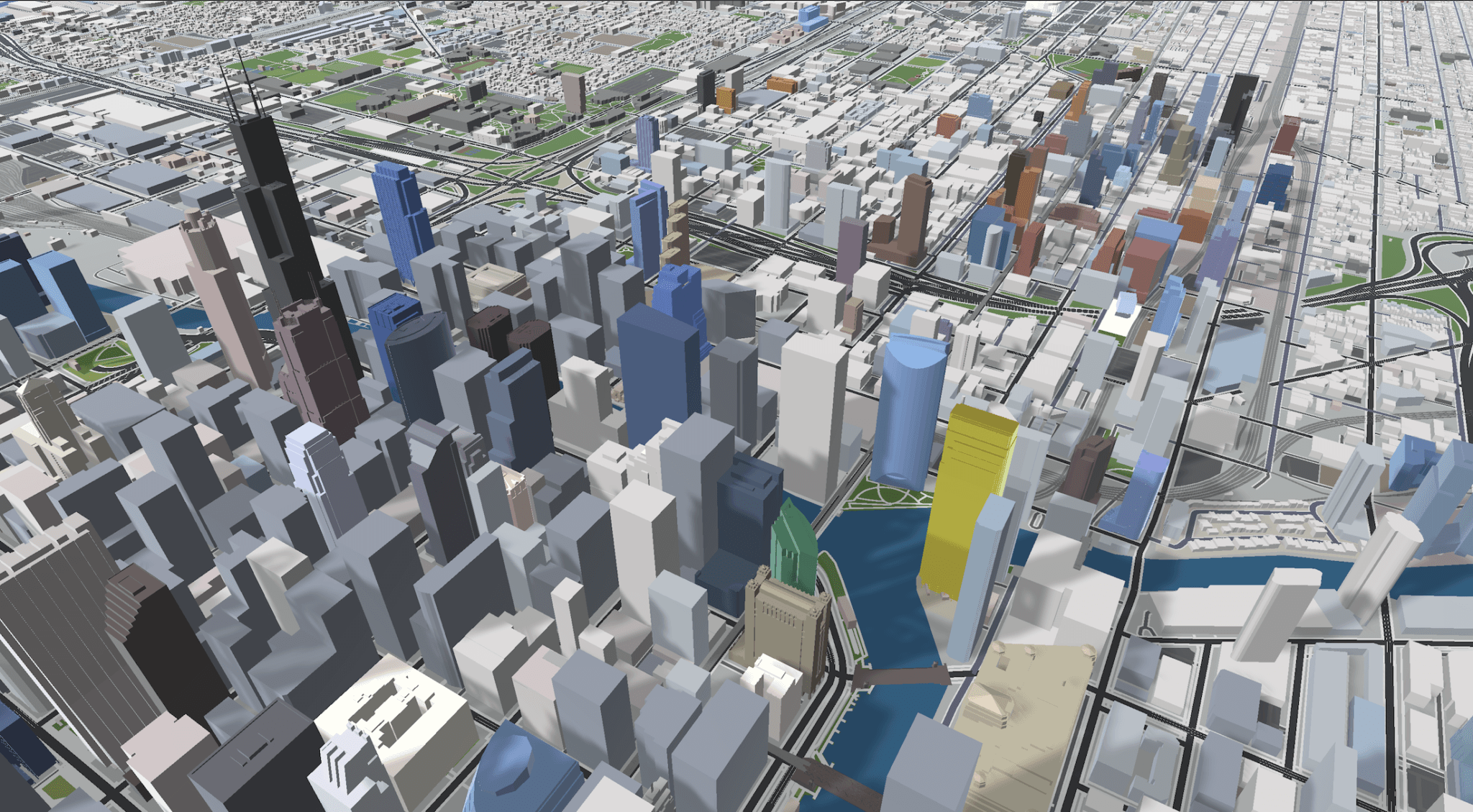
First experiments with realistic building colors - muted palette, basic lighting
Adding infrastructure detail and improving environmental context
Full color palette with parks, waterfront, and refined lighting
Camera angles emphasizing verticality and spatial relationships
Enhanced Color Palette
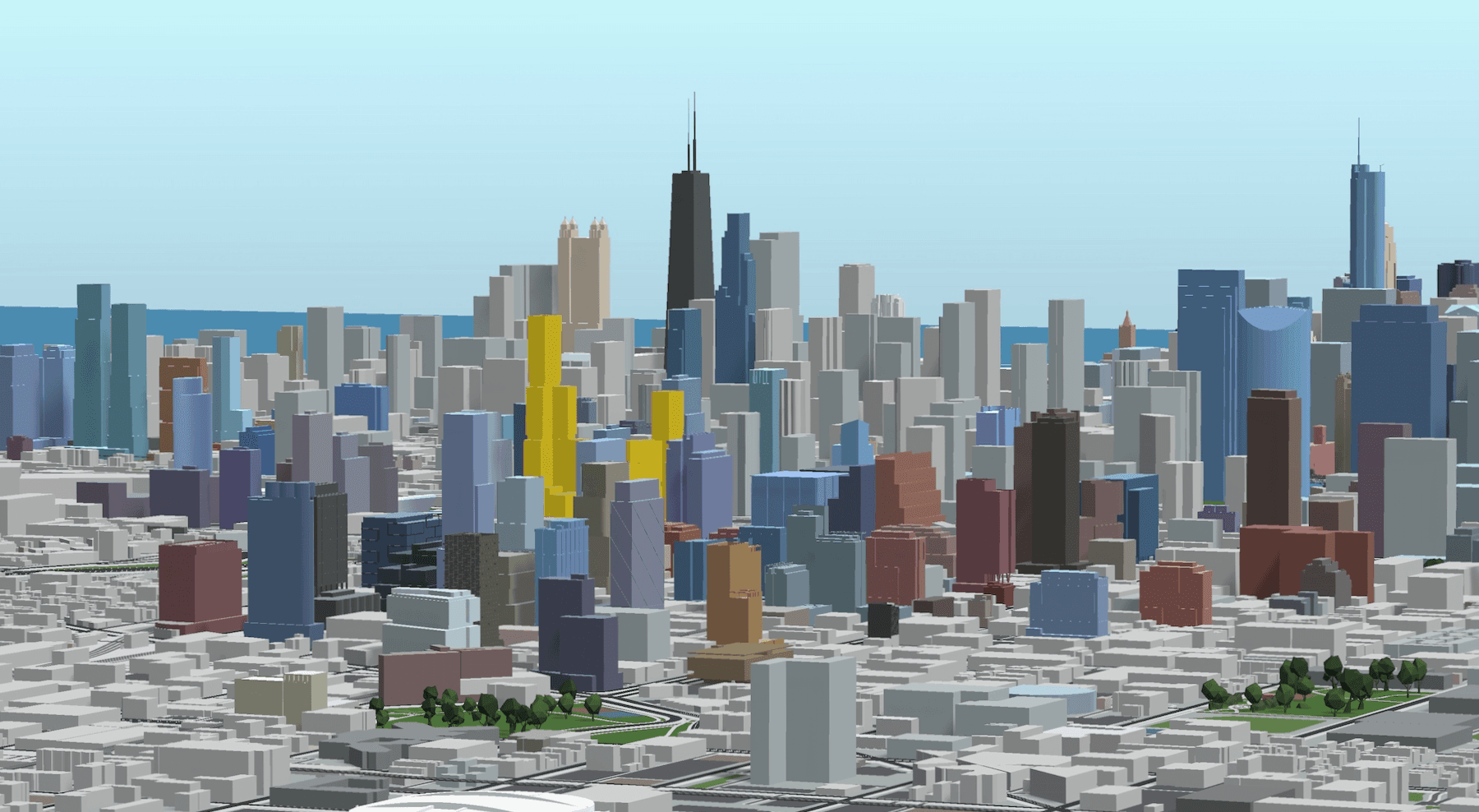
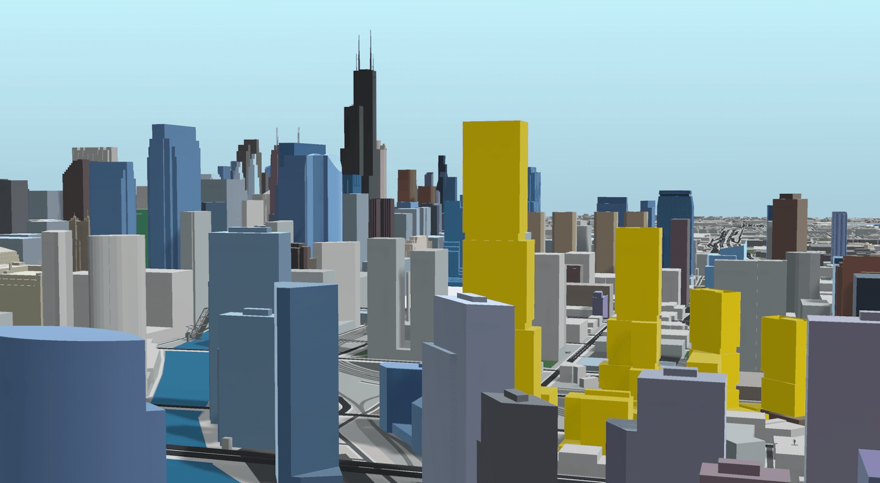
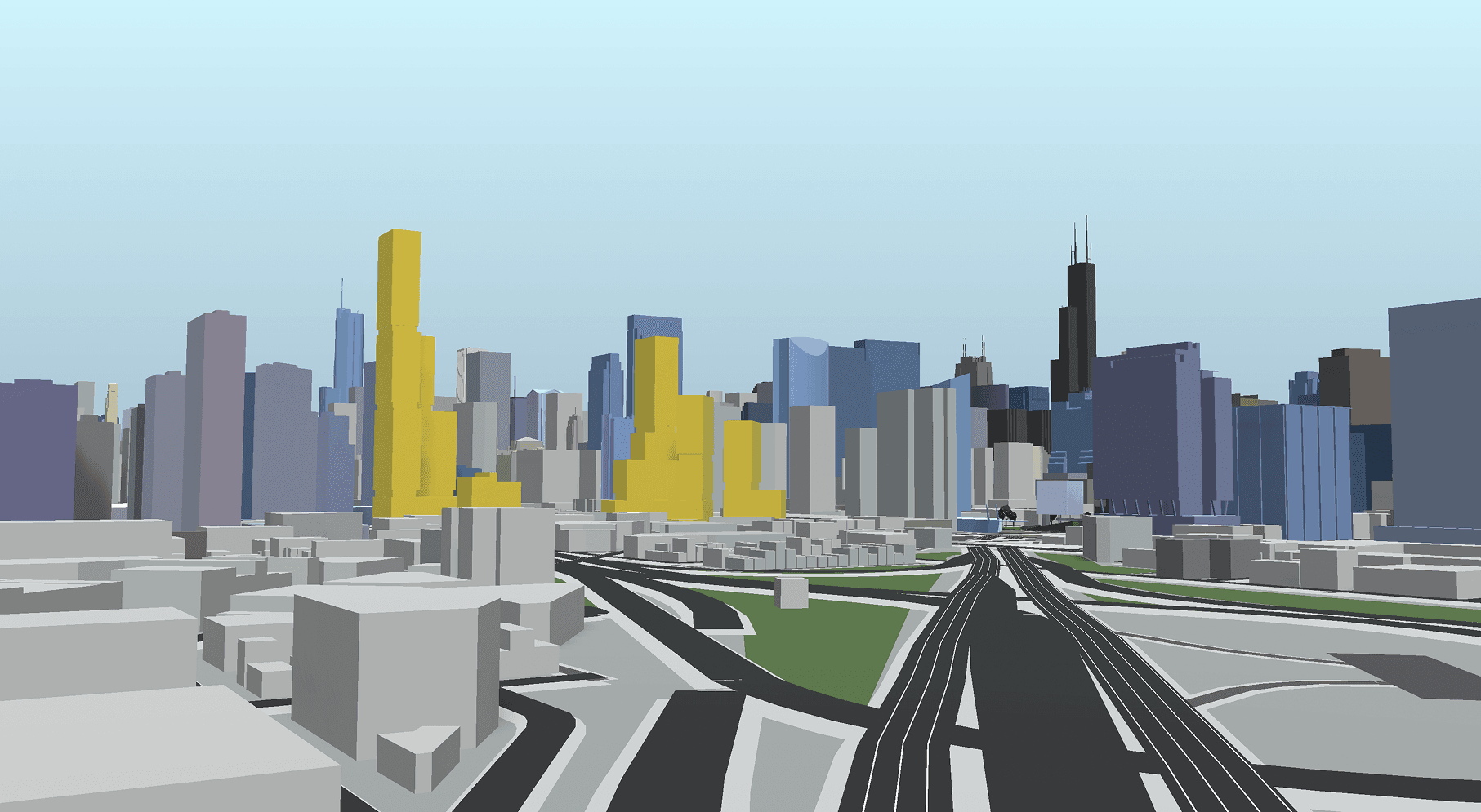

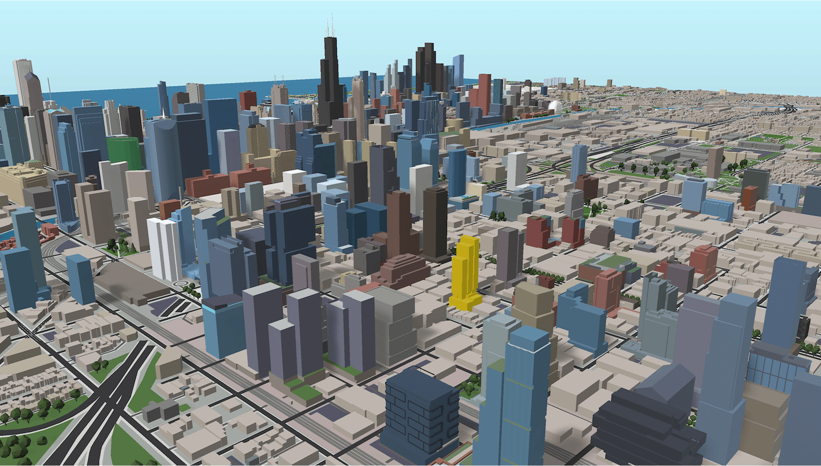
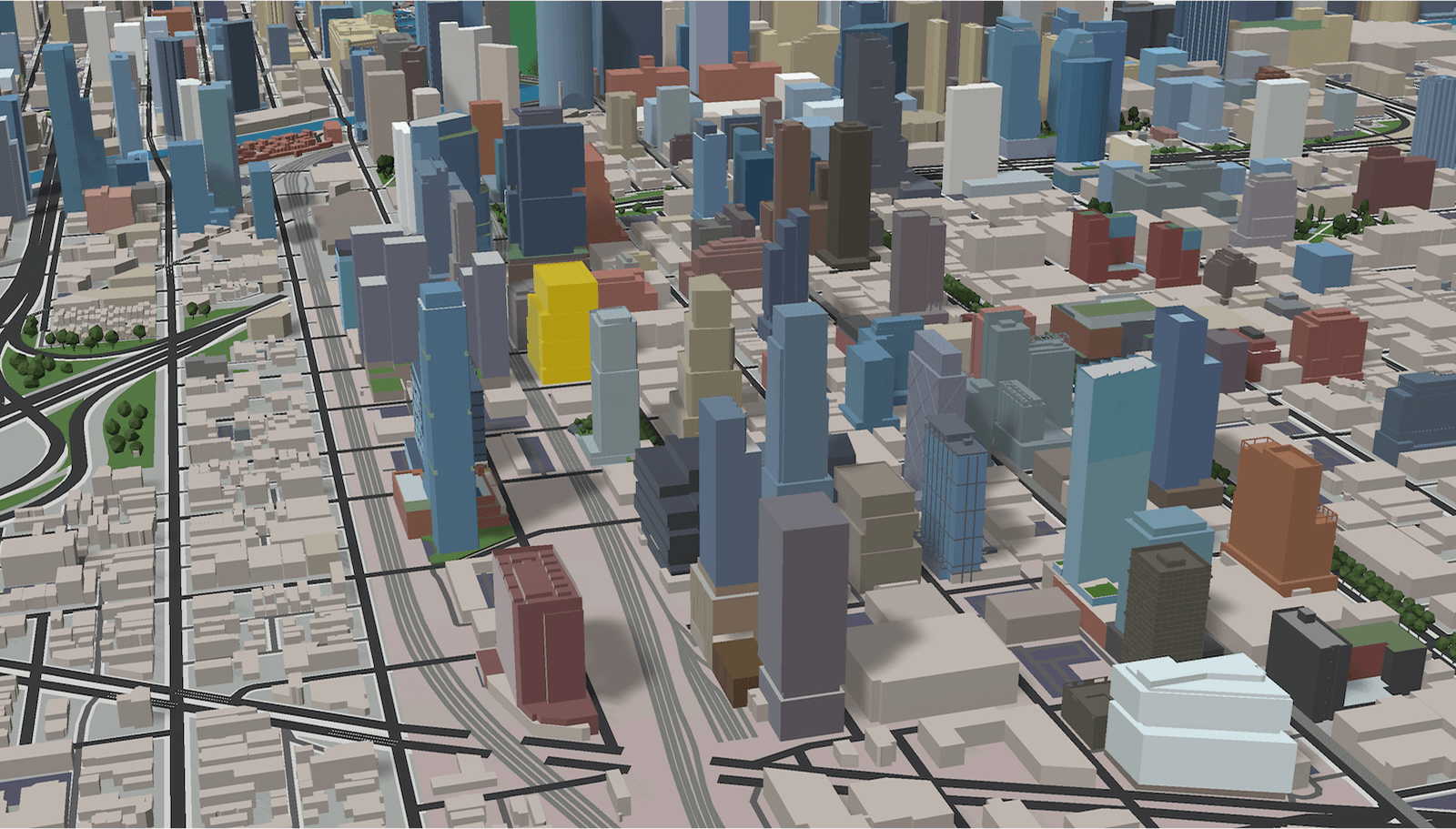
Fine-tuning the aesthetic: enhanced color saturation, prominent gold highlight for featured projects, camera field-of-view experiments balancing scale and perspective.
VISUALIZING CONTINUOUS DATA
Not all data layers are categorical. Height is continuous - how do you show that?
Solution: Color gradients mapped to value ranges.
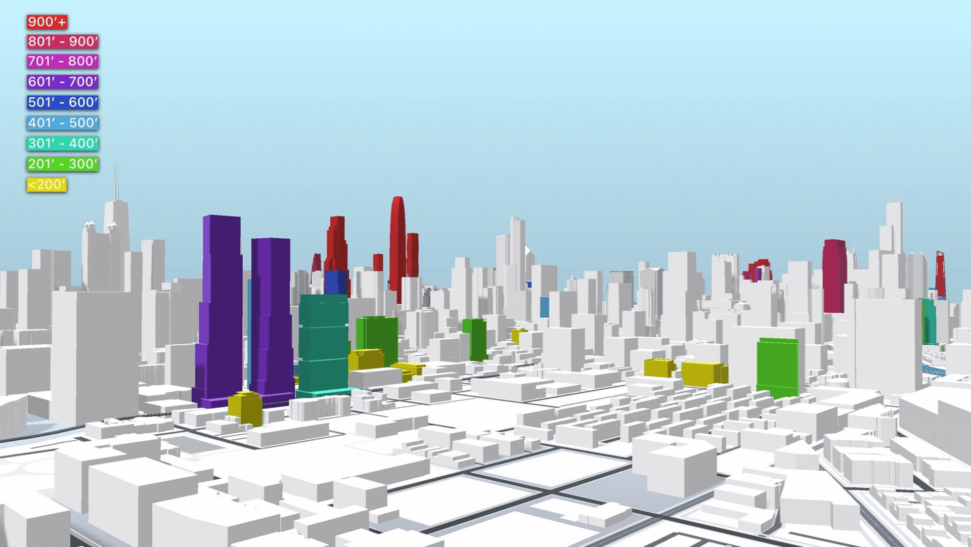
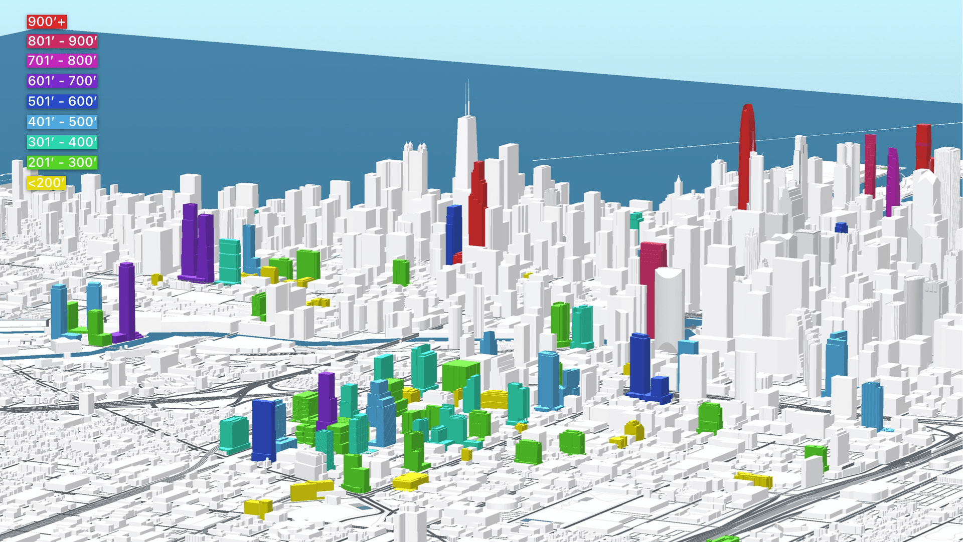
This 9-level gradient started with subtle yellow for buildings under 200 feet, progressing through greens and blues for mid-rise structures, and culminating in vibrant orange and red for towers over 900 feet. Background buildings were rendered in pure white to ensure the 9-color gradient remained easily readable. The color progression made height patterns instantly recognizable across the entire skyline.
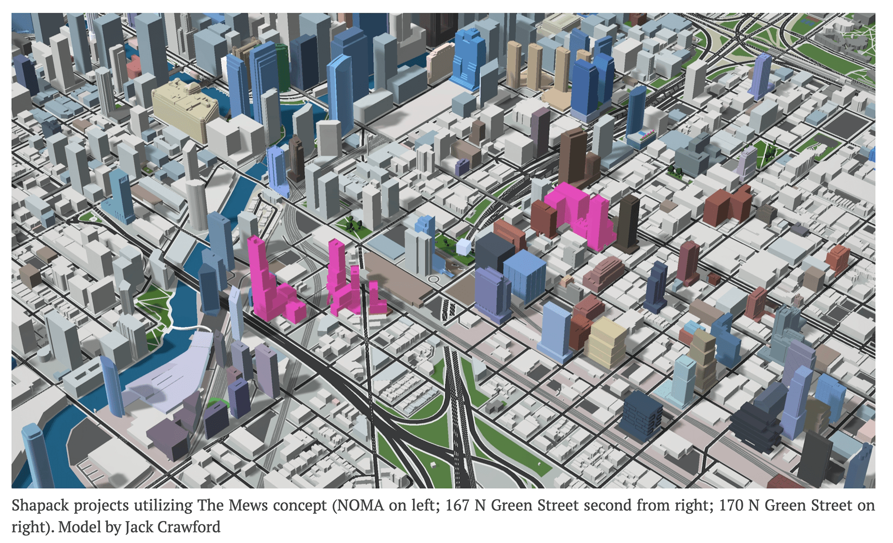
Combining natural aesthetics with highlighted categorical layers. In one article I used pink to highlight multiple projects with a specific feature.
KEY INSIGHT
Aesthetics aren't superficial - they're strategic. Making the tool visually appealing increased usage and shareability, which drove more feedback and feature requests. Beauty compounds.
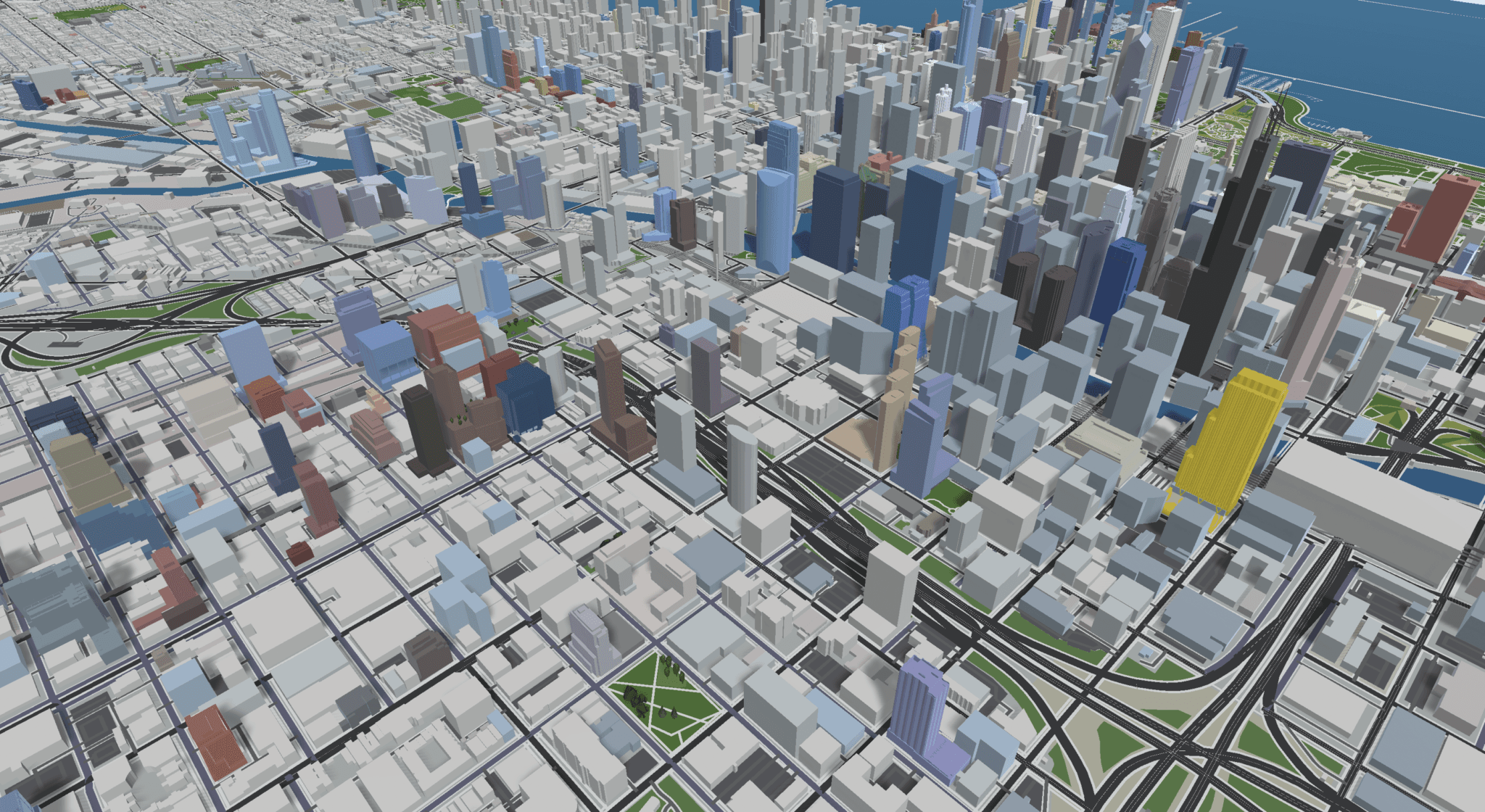
VISUALIZATION AS ARGUMENT
By late 2022, I was using the model not just for visualization, but for advocacy. Data presented visually makes arguments that text cannot.
Three projects exemplified this shift:
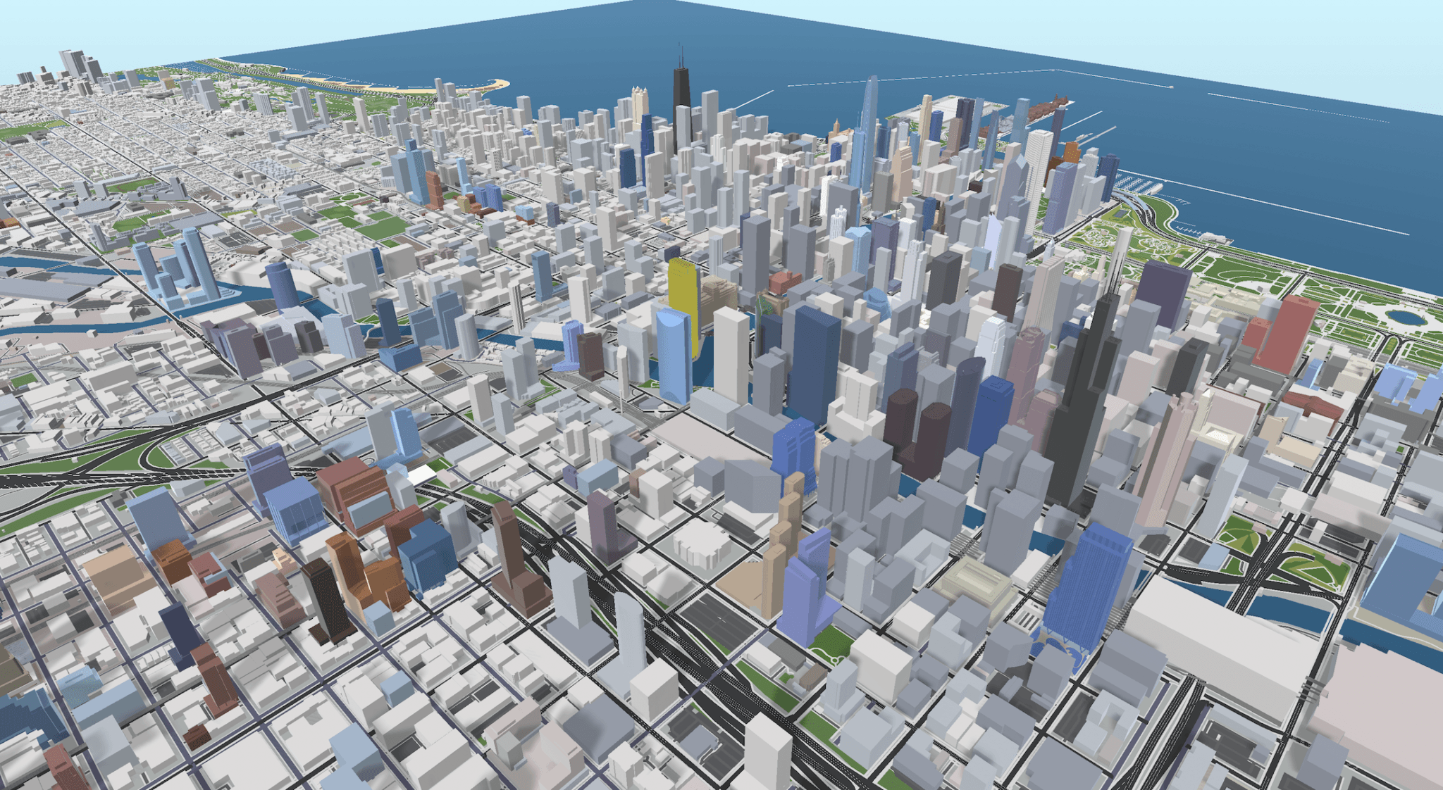
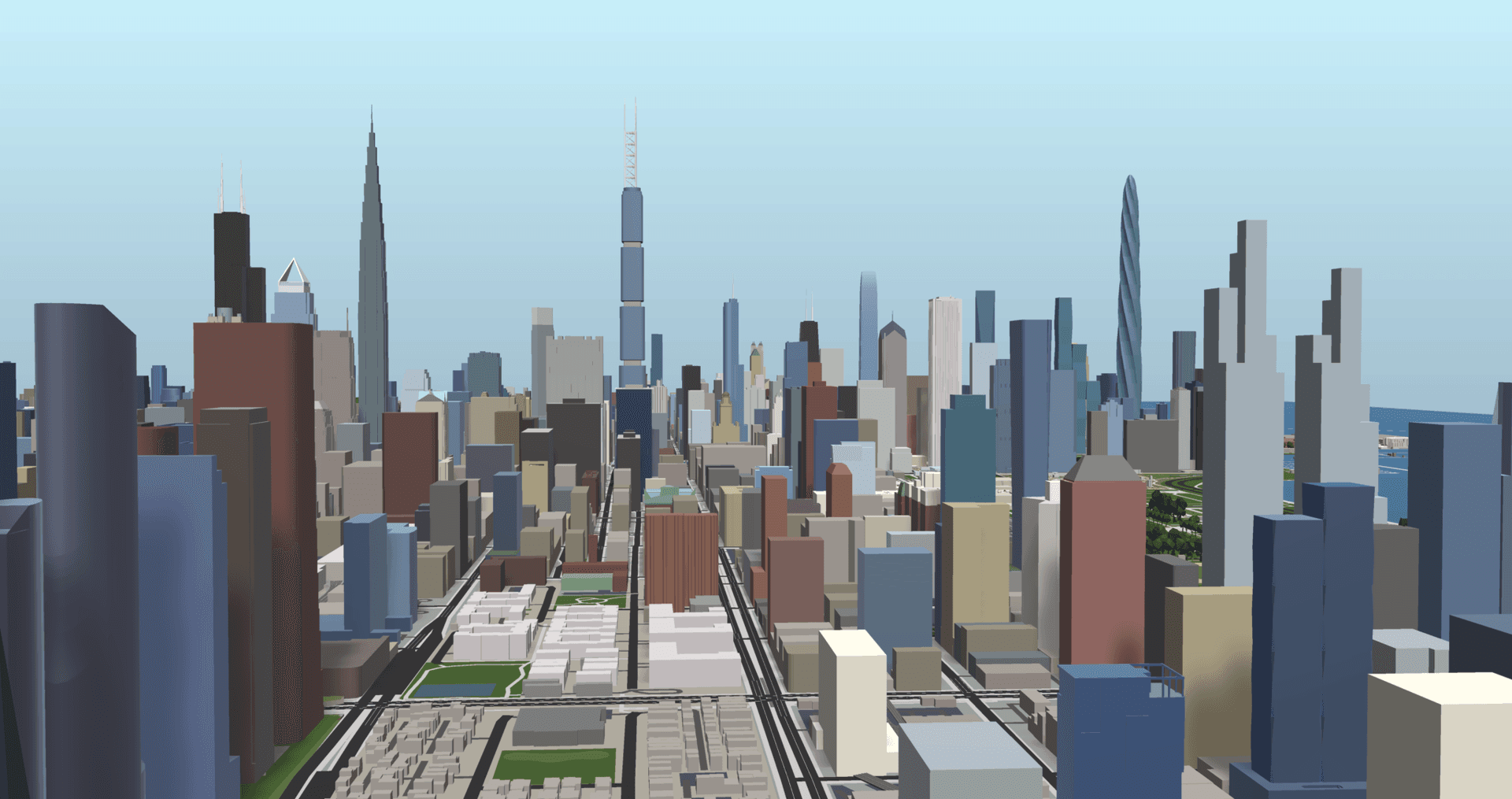
- COMPLETE CITYSCAPE: Applied natural colors to ALL buildings over 200 feet, not just in-development projects. Full context shows what's changing vs what already exists.
- ALTERNATIVE SCENARIOS: Modeled canceled mega-projects to show "what if?" Chicago has a history of ambitious proposals that never got built. Seeing them in context sparked conversations about opportunity cost.
- COMPARATIVE ANALYSIS: Extracted Chicago's tallest under-construction towers and placed them side-by-side with New York's to make a visual argument about scale and ambition.
The model had become a rhetorical device.
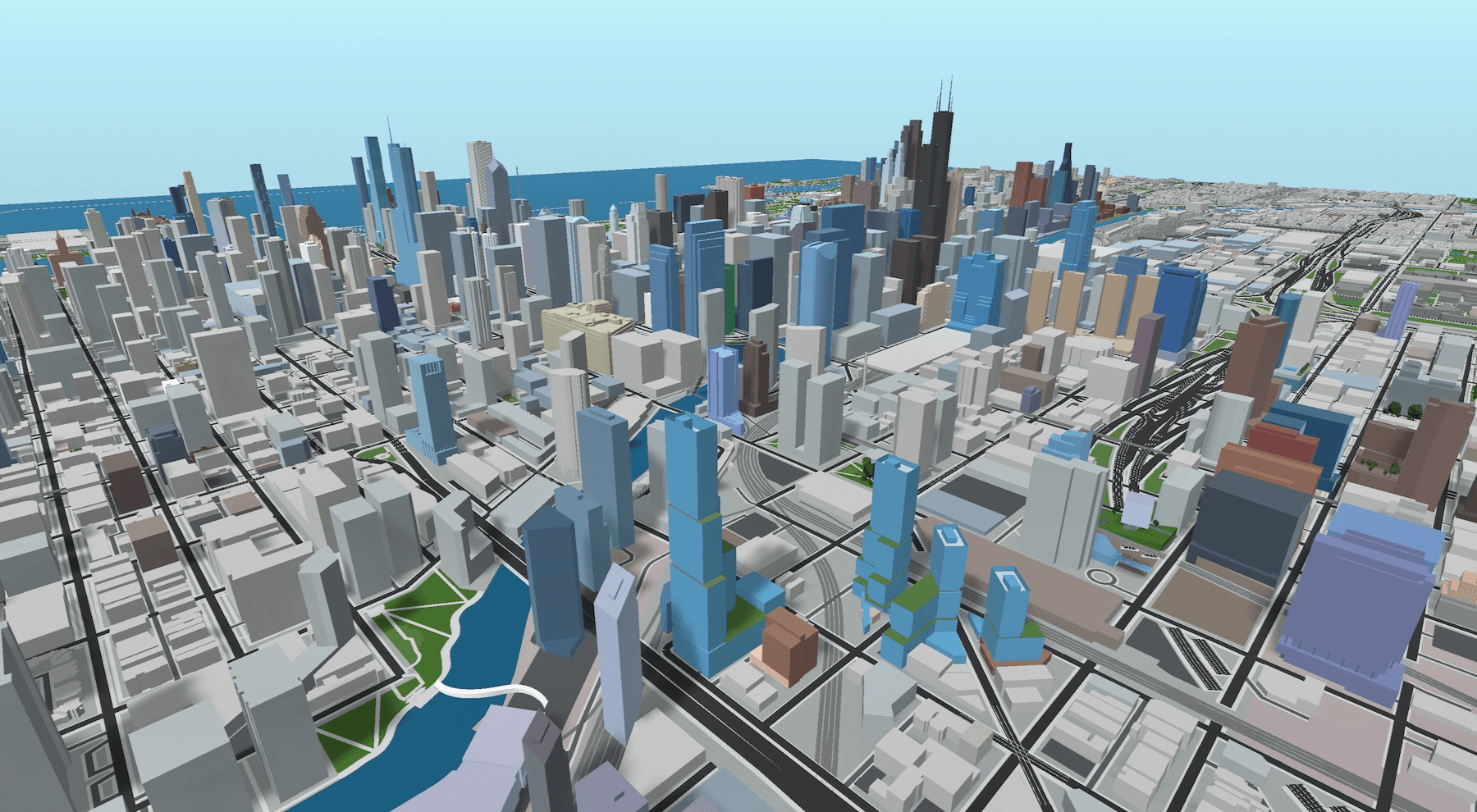
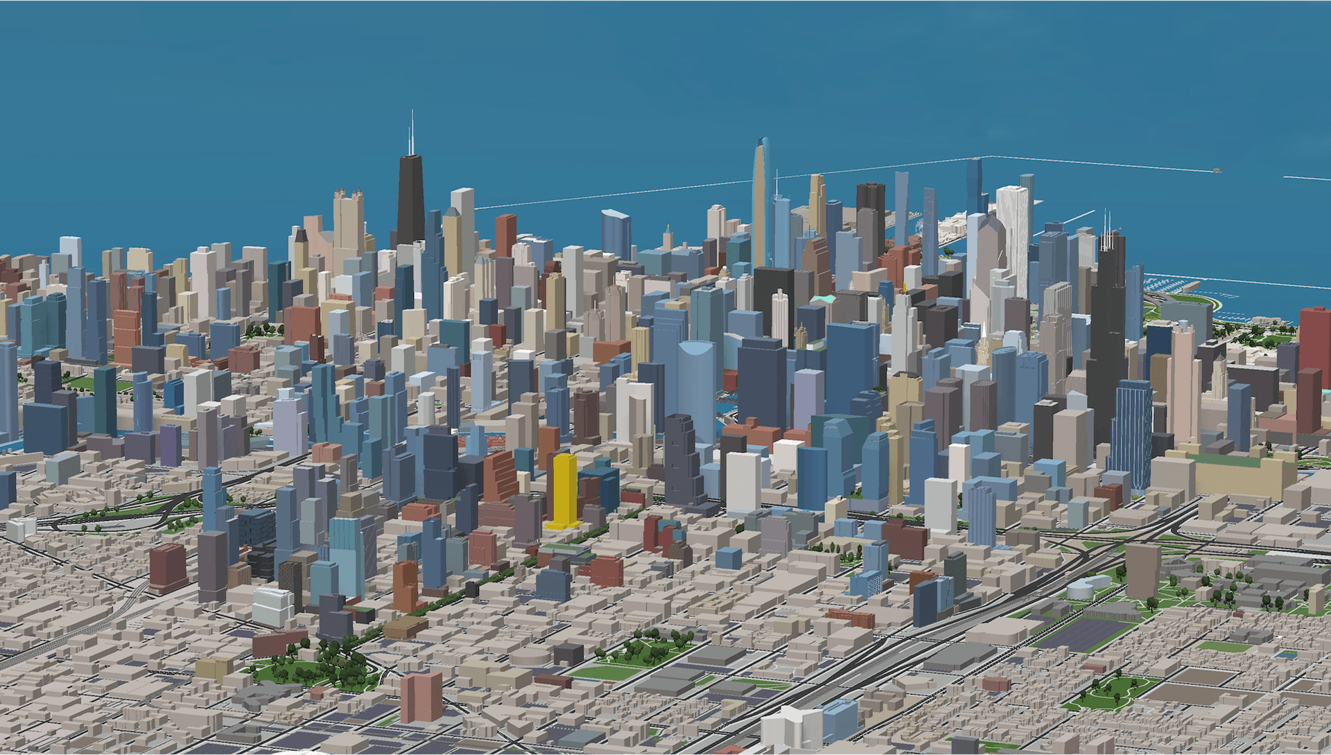
Complete Cityscape
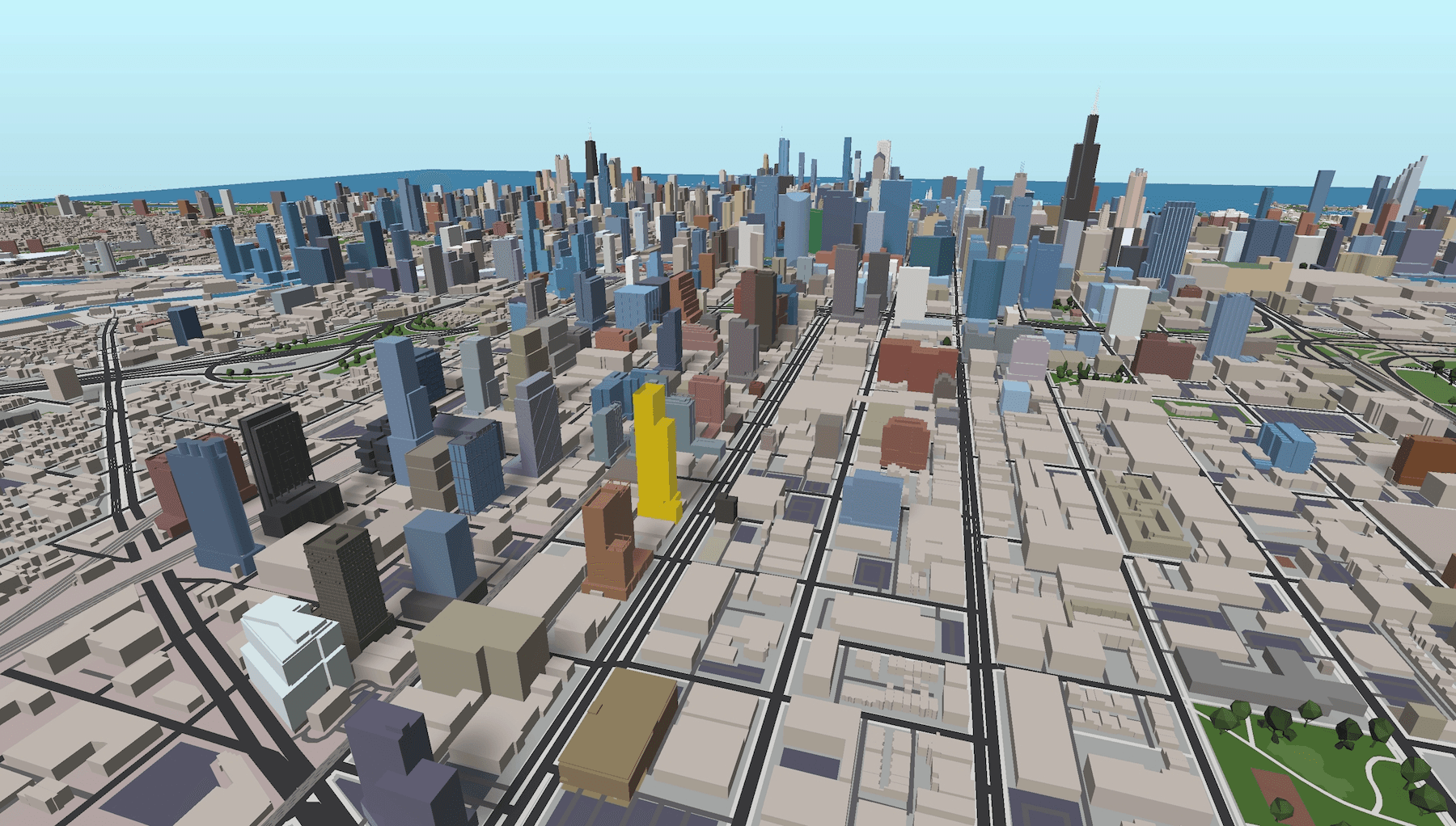
September 2022: Natural colors applied to all existing high-rises, providing complete visual context for new developments. Non-highrise buildings were colored in a warm beige tone to match the city backdrop, replacing the previous grayscale aesthetic. This transformation made the model feel like exploring a living city.
THE POWER OF "WHAT IF"
What if Chicago's most ambitious canceled projects had actually been built? I used the model to visualize never-built mega-developments, showing readers what the skyline would look like today if these proposals had proceeded.
Two views told the complete story: natural colors to show visual impact, status layer (in red) to emphasize their hypothetical nature.
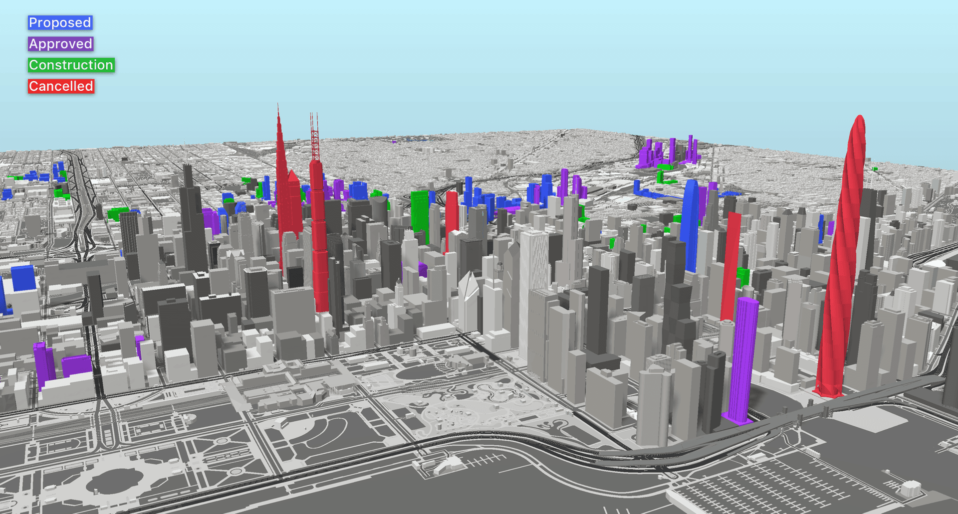
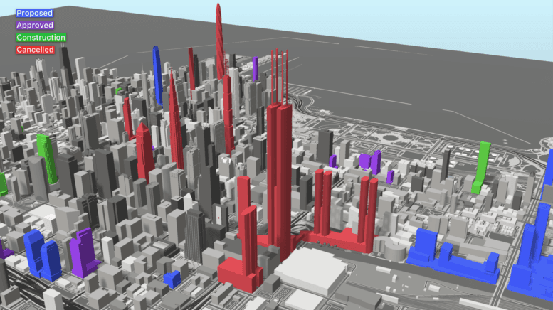
Canceled projects shown in natural view (left) and status layer in red (right) to contextualize their scale and hypothetical nature
COMPARATIVE ADVOCACY
At the end of 2022, both Chicago YIMBY and New York YIMBY ran their annual countdown of tallest projects under construction. I saw an opportunity for visual storytelling.
I extracted the top 15 from each city and arranged them side-by-side by ranking - starting with Chicago's #15 next to New York's #15, adding the next tallest pair each day until reaching #1 on the final day of the countdown. The Willis Tower, Eiffel Tower, and Great Pyramid of Giza appear alongside the lineup as scale references.
The image made an argument without words: New York (orange) is building at a dramatically larger scale than Chicago (green), America's supposed "second city" of skyscrapers.
This visualization helped readers understand the scale gap between the two markets and sparked discussions about Chicago's regulatory environment and development pipeline.
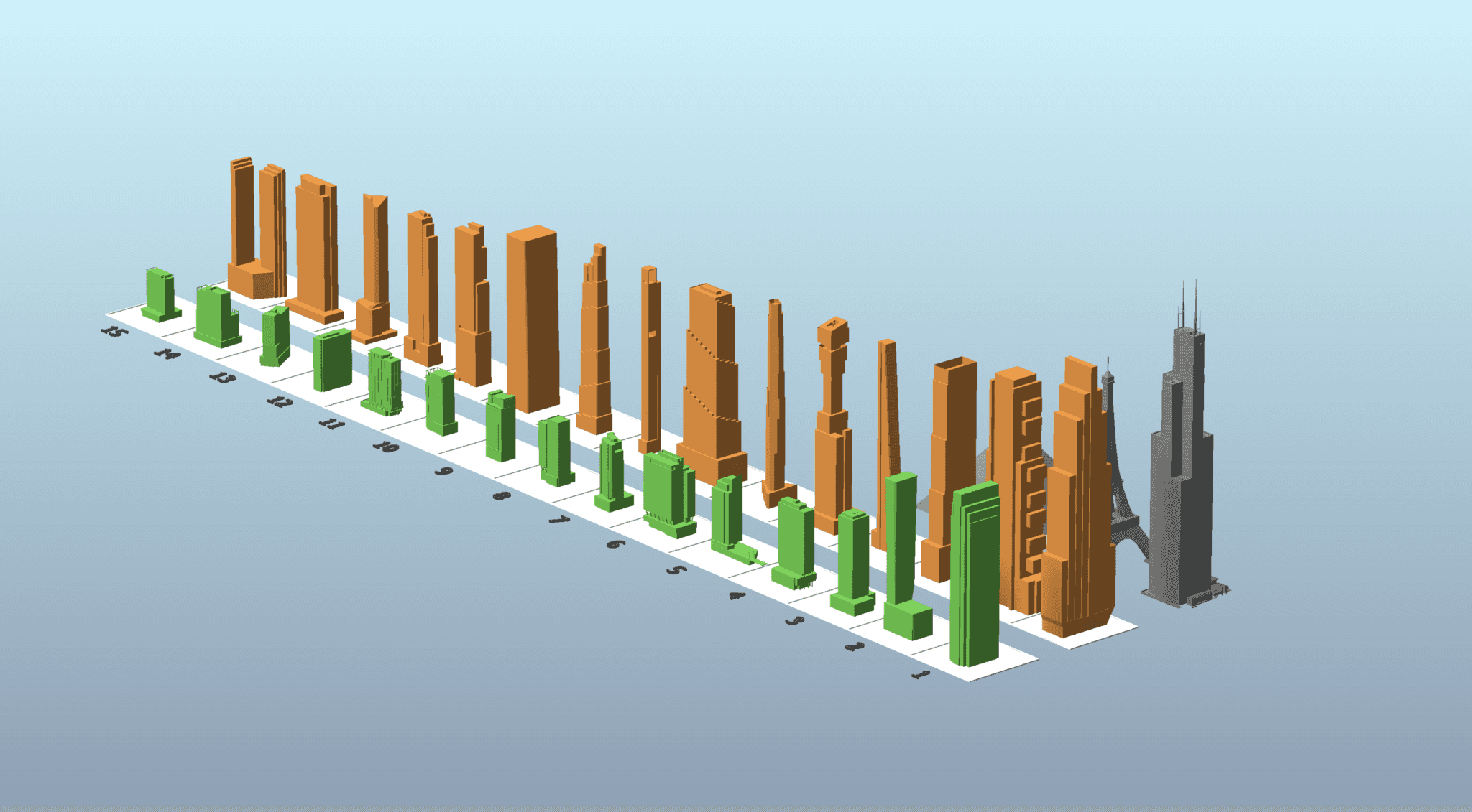
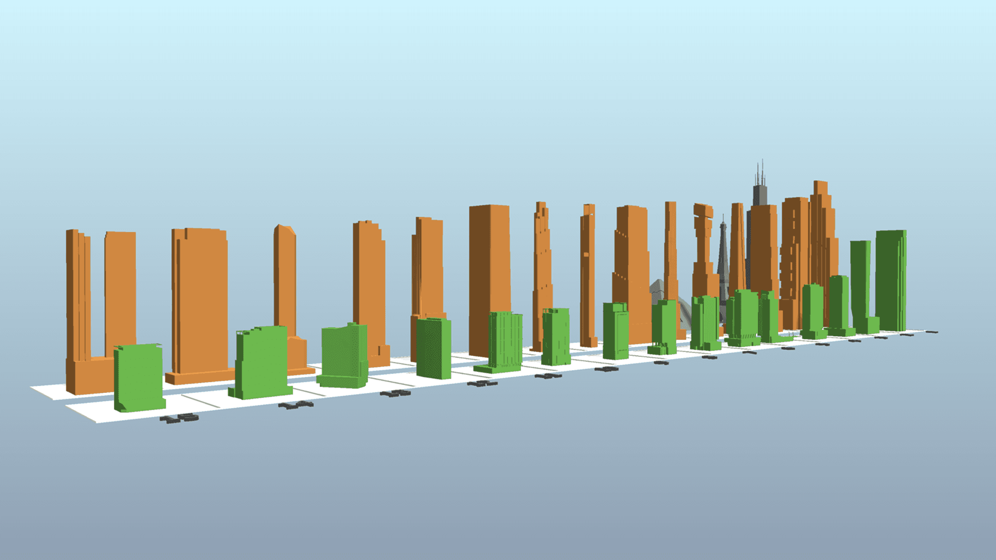
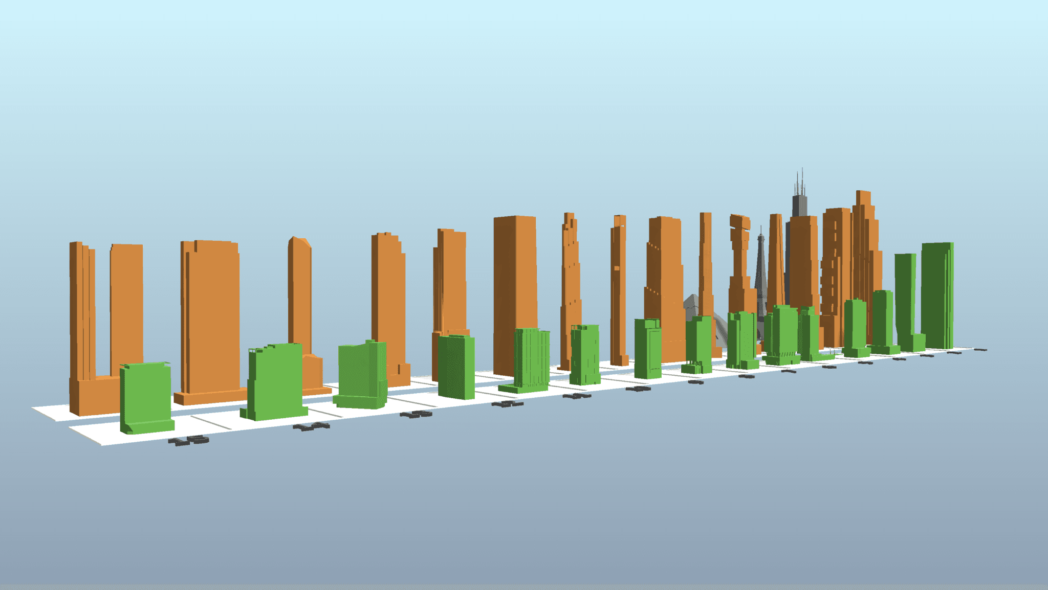
Chicago vs NYC: Side-by-side comparison of tallest under-construction projects by ranking. Each city's towers arranged in descending height order with Willis Tower for scale reference. The visual disparity tells the story immediately.
KEY INSIGHT
The model evolved from visualization tool to rhetorical device. By presenting data spatially and visually, I could make arguments that resonated more powerfully than statistics alone. This is the real power of data visualization - not just showing what is, but making people feel what could be.
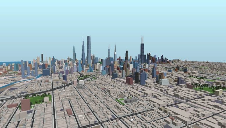
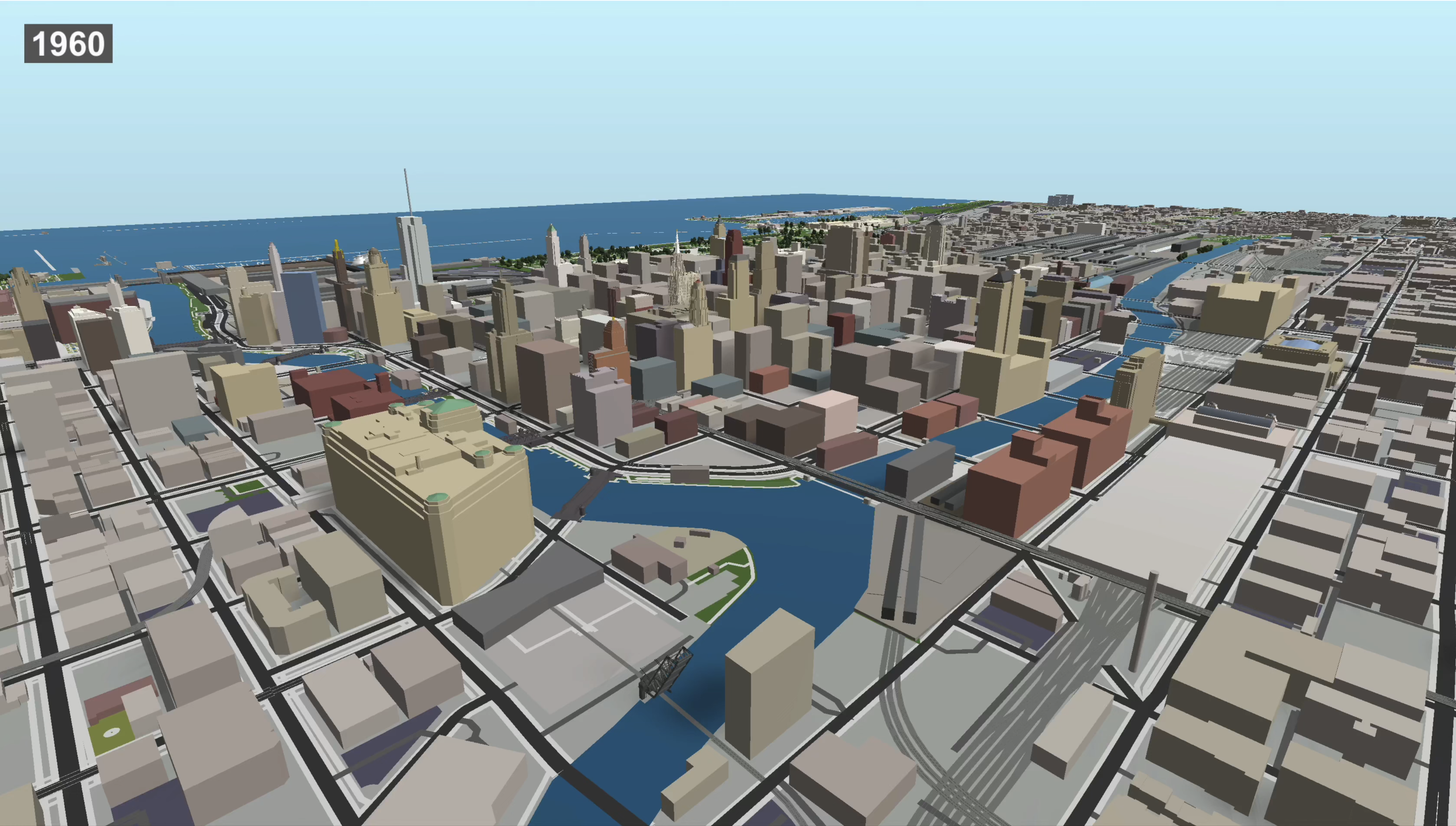
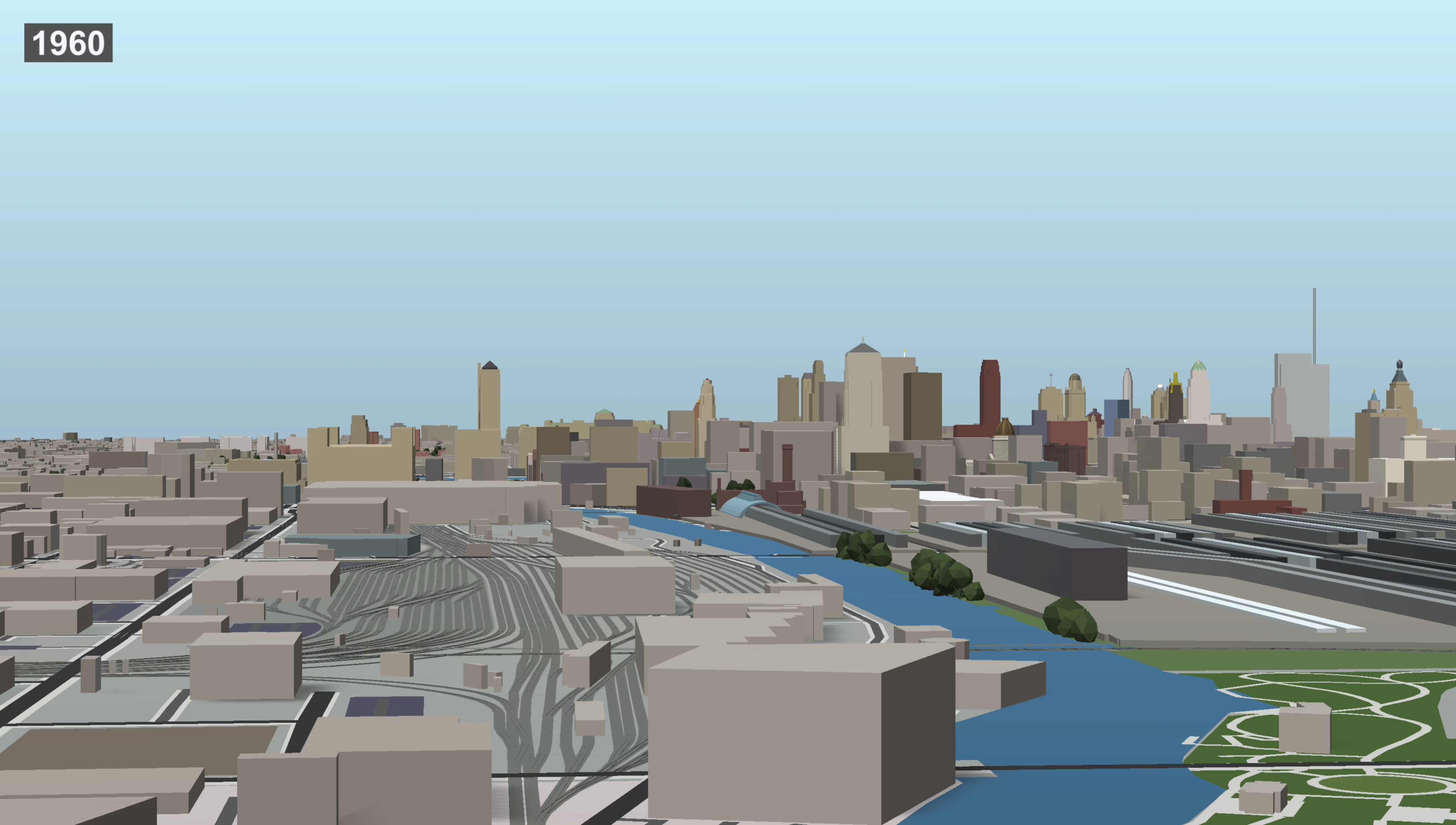
70+ YEARS OF URBAN GROWTH
TIME AS A DIMENSION
One of the most powerful ways to understand a city is to see how it evolved. I wanted to show a continuous transformation rather than a more limited slideshow of historical photos.
I added completion year data to every building in the model, then built a timeline system that could show/hide buildings based on date. The result: a 73-year timelapse from 1960 to 2033 (including planned future completions).
Watch neighborhoods transform. See boom periods and recessions. Understand which areas developed early vs late. All in four dimensions - three spatial dimensions with actual building forms, plus time - not abstract bars on a chart.
These timelapses became some of the most-shared content in Chicago YIMBY's history.
Wolf Point Development Corridor
Chicago River Corridor
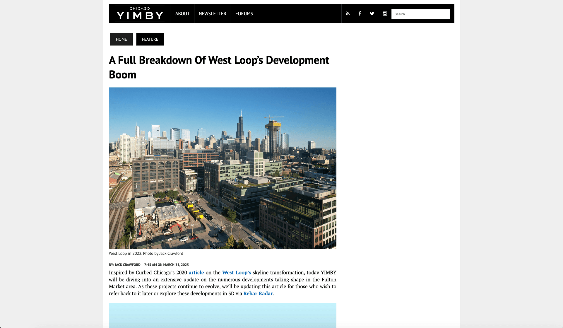
THE ARTICLE THAT CHANGED EVERYTHING
In Spring 2023, I published a comprehensive breakdown of West Loop's development boom. Rather than covering projects individually (my usual approach), I analyzed the entire neighborhood holistically - breaking down the pipeline by height ranges.
The article used the model extensively: multiple angles, different data layers, and an "x-ray effect" showing which buildings fell into each height category.
Reader response was overwhelming. People didn't just want to read about developments - they wanted to explore the data themselves. They wanted filters, sorting, export capabilities.
This was product-market fit validation. People would pay for this.
Starting point: All West Loop in-development projects in natural color view, providing complete spatial context
All Buildings
Each height range section began with an 'x-ray effect' showing its distribution across the neighborhood. Same camera angle for direct comparison.
Multi-Angle Analysis
Four angles of the same dataset, each revealing different spatial relationships and clustering patterns. This comprehensive approach resonated deeply with readers.
KEY INSIGHT
This single article generated more engagement than anything I'd published before. The feedback was unanimous: readers wanted granular filtering, comprehensive views, and the ability to explore data themselves - not just view static screenshots.
The path forward crystallized: turn this into a platform.
FROM TOOL TO PLATFORM
By mid-2023, my co-founder and I had partnered with YIMBY Network - the parent organization behind Chicago, Miami, and New York YIMBY. This partnership gave us:
- Access to their comprehensive project databases
- Built-in distribution through their established readership
- Brand validation and credibility
But raw data wasn't enough. Project information lives in hundreds of articles, each with slightly different formats and structures. We needed a way to extract structured data from unstructured text.
The solution: an AI-powered extraction pipeline.
TURNING ARTICLES INTO DATA
The biggest technical challenge was data acquisition. Development projects are announced through news articles, not structured databases. How do you turn natural language into queryable data at scale?
We built an extraction system that:
- Ingests article text from YIMBY publications
- Uses LLMs to identify key fields (height, address, developer, architect, status, units, square footage, etc.)
- Validates extracted data against known patterns and ranges
- Reconciles conflicting information across multiple sources
- Outputs clean JSON for the platform database
This is the same challenge faced by any company processing unstructured documents - legal contracts, insurance policies, medical records. The architecture is broadly applicable beyond real estate.
270 Park Avenue
JPMorgan Chase has unveiled plans for its new headquarters at 270 Park Avenue, a landmark development in Midtown Manhattan. The supertall office tower, designed by renowned architecture firm Foster + Partners, will stand at an impressive 1,388 feet, making it one of the tallest buildings in New York City. The JPMorgan Chase headquarters is currently under construction and is expected to be completed in 2025. The project represents a significant investment in Manhattan commercial real estate.
LLM-powered extraction (OpenAI GPT-4o) with regex validation and business rules. Multi-source reconciliation when data conflicts. Similar architecture to document intelligence systems in legal, insurance, and healthcare verticals.
BEYOND THE 3D VIEWER
While Unity models were powerful, they had limitations: download requirements, WebGL performance issues, poor mobile experience. We needed a web-native dashboard.
The platform we built provided:
- Interactive map with project pins and clustering
- Filterable, sortable data tables with advanced queries
- Analytics and aggregations (by year, status, neighborhood, developer)
- Real-time updates as new projects are added to the database
- Export functionality for researchers and professionals
- User accounts with saved searches and notifications
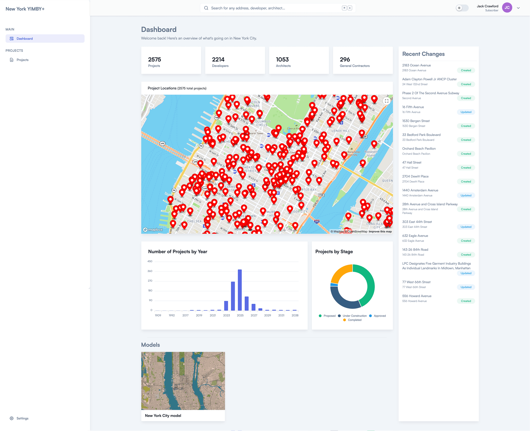
Dashboard overview: 2,575 projects tracked across New York City. Map with location pins, charts showing distribution by year and construction stage, recent activity feed with live updates.
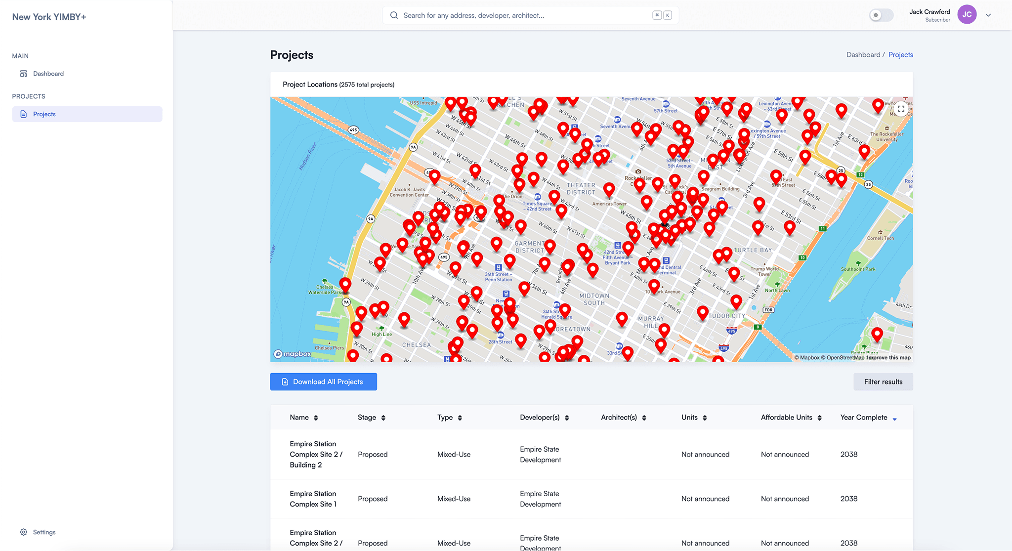
Projects table: Sortable columns for name, stage, type, developer, architect, units, and completion year. One-click export for all data.
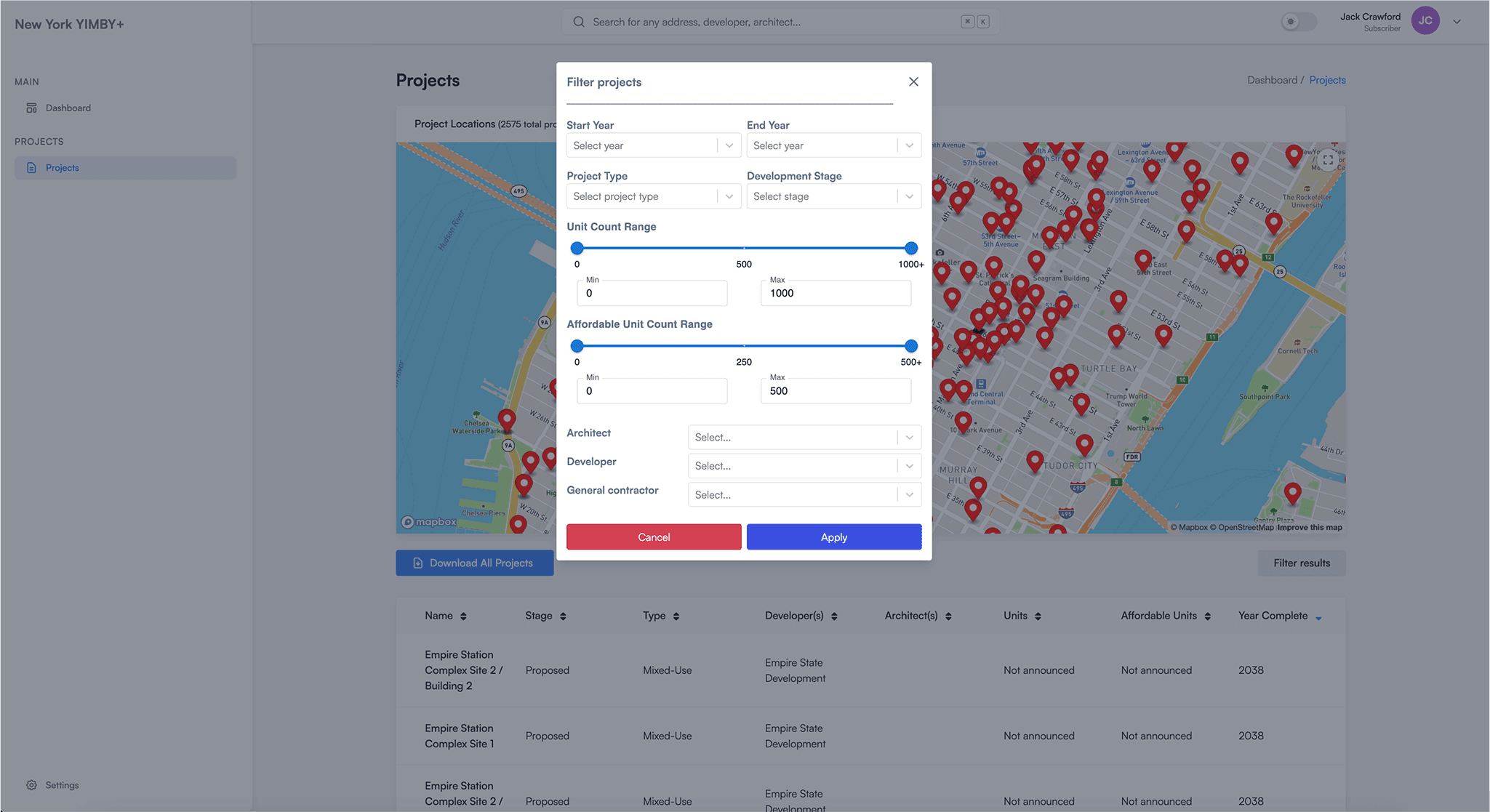
Advanced filtering system: Narrow by stage, type, height range, developer, architect, neighborhood, and more. Boolean logic for complex queries.
PROVING THE MODEL
If the platform worked for Chicago, would it work elsewhere? Between June and November 2023, we launched three cities to find out:
- CHICAGO (June 2023) - Home market, 20 data layers plus the 1960-2033 timelapse
- MIAMI (September 2023) - Test in a different urban context (waterfront focus)
- NEW YORK (November 2023) - Largest dataset with 5,000+ projects and 200+ of the largest rendered in 3D
Each launch validated the platform in a new market. New customers continued to validate the product by subscribing for $40 a month or signing up for yearly subscriptions.
Chicago YIMBY+ Demo
1.7K views • June 2023
Miami YIMBY+ Demo
2.3K views • September 2023
New York YIMBY+ Demo
3.2K views • November 2023
Interactive demonstrations showing the platform's 20 data layers, timelapse functionality, filtering system, and web dashboard across three markets
KEY INSIGHT
Multi-city expansion proved the model was reproducible. The same technical architecture and UX patterns worked across vastly different urban contexts - Chicago's grid vs Miami's waterfront vs New York's density. This validation gave us confidence to continue building.
STAKEHOLDER INTELLIGENCE
As the platform grew, users started asking questions geared towards market intelligence:
- "Which developers are most active in this neighborhood?"
- "What has this architecture firm designed recently?"
- "Who are the dominant general contractors?"
This required expanding our data model from tracking buildings to tracking stakeholders and their relationships. Every developer, architect, contractor, and owner mentioned in our database became a queryable entity.
The result: instant industry analysis.
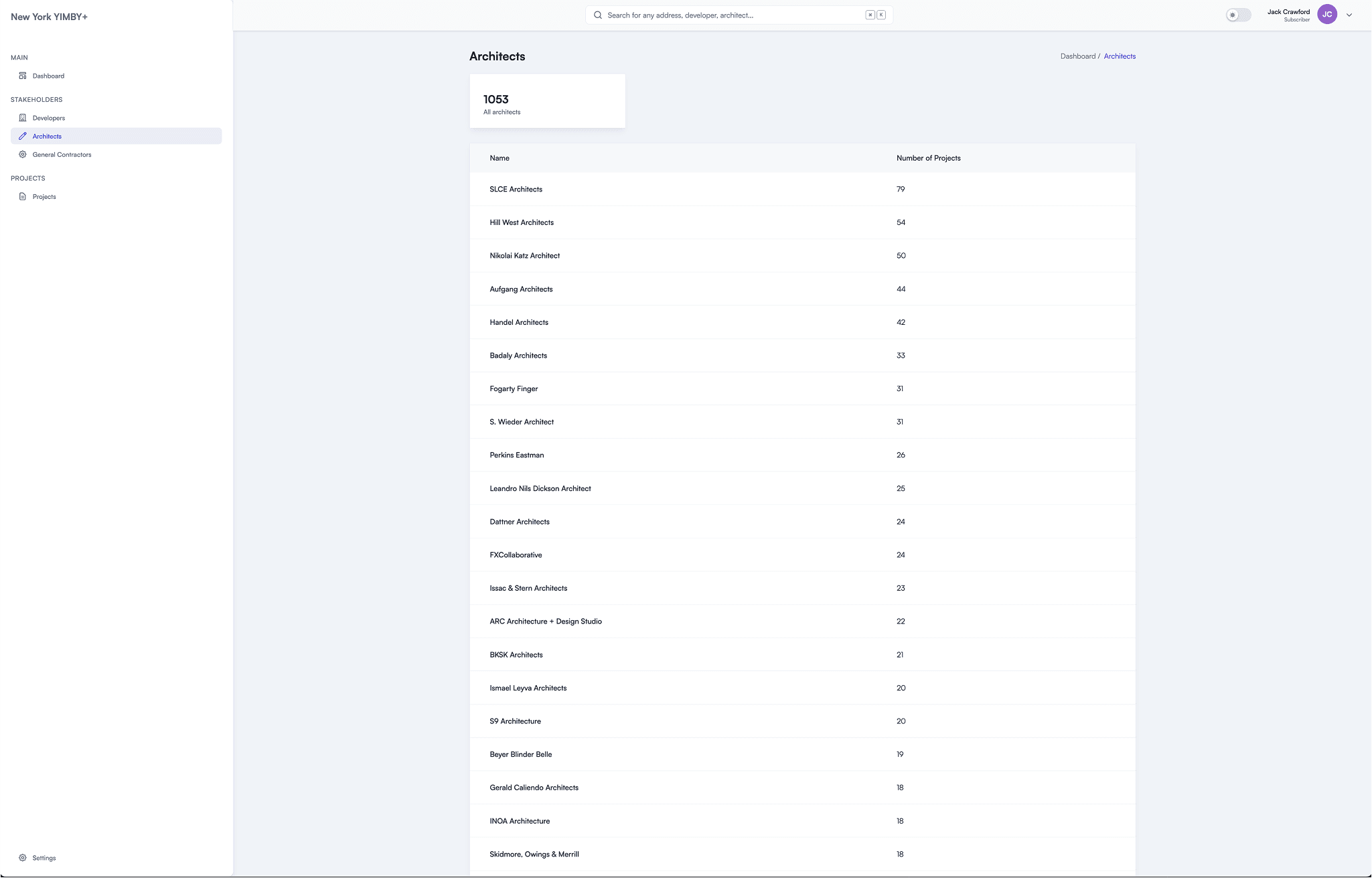
1,053 architecture firms ranked by project count. SLCE leads with 79 projects. Click any firm to see their complete portfolio.
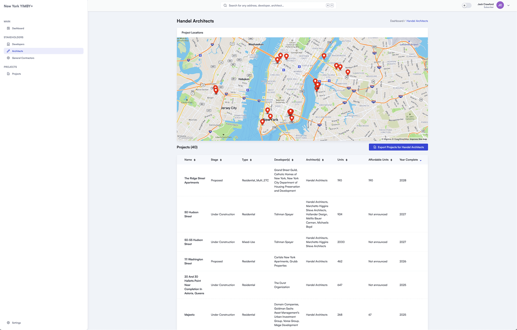
Individual stakeholder profiles show all associated projects, filterable by status, height, and completion date. Market intelligence at a glance.
ARCHITECTURAL EVOLUTION
Unity provided powerful 3D rendering but had critical limitations:
- Required WebGL (performance-heavy, desktop-only)
- Difficult to integrate with standard web components
- Poor mobile experience
We needed a hybrid approach: Unity's visual impact with web-native accessibility.
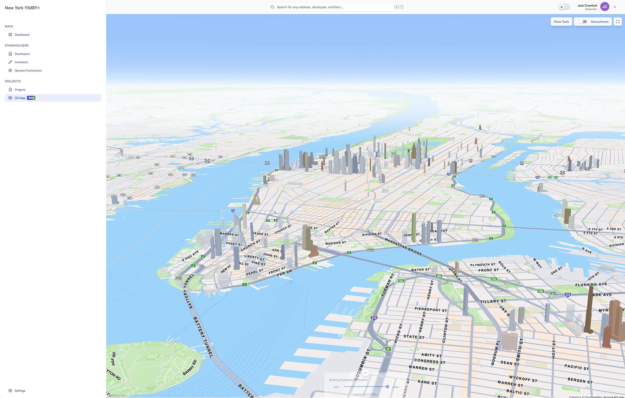
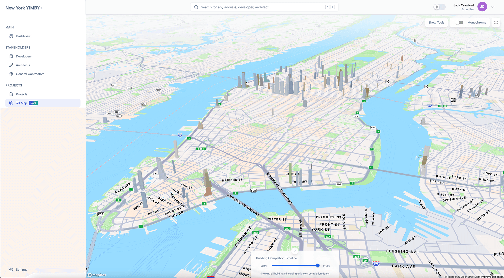
The solution: Mapbox GL JS with GLTF building overlays.
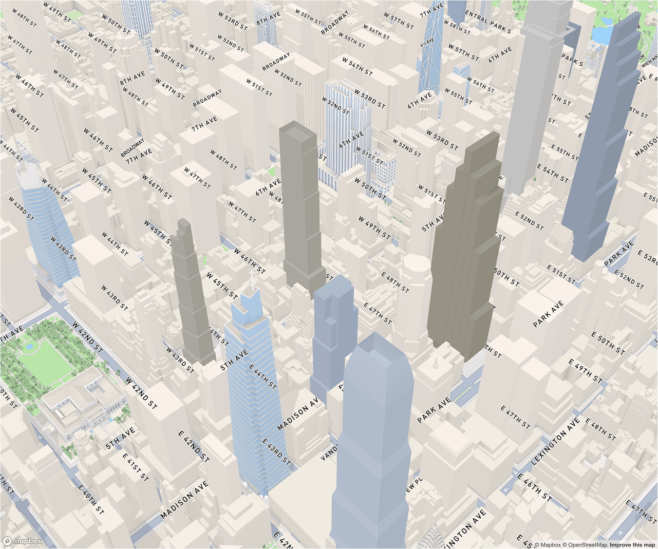
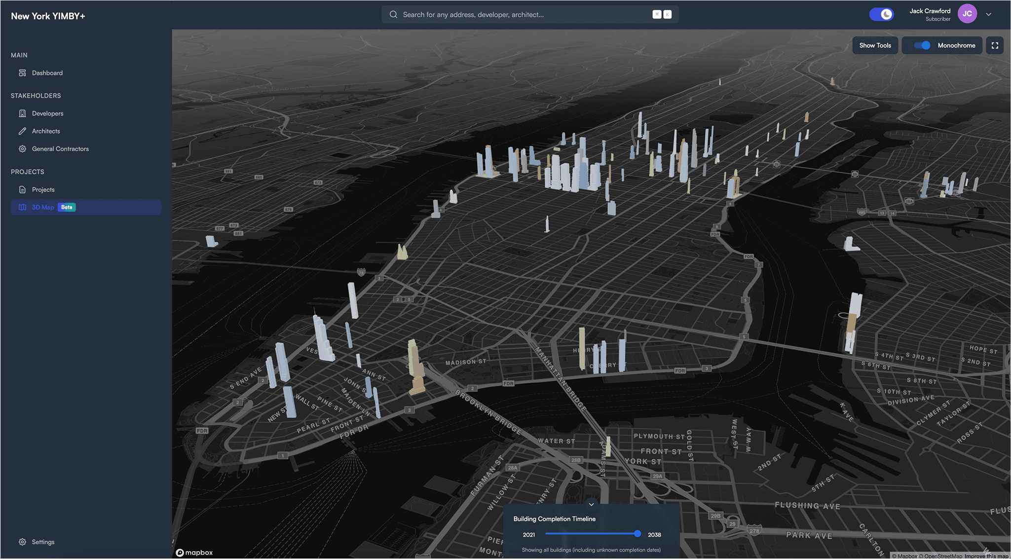
Mapbox integration: 3D building models rendered on familiar street maps. Users get street names, neighborhood context, transit lines, and spatial understanding - all in a standard web browser on any device.
WHY BOTH?
Rather than choosing Unity OR Mapbox, we maintained both:
UNITY:
- High-quality renders for marketing and presentations
- Timelapse features with precise timeline control
- Screenshot generation for articles
- Cinematic camera control for storytelling
MAPBOX:
- Web-native browsing experience
- Mobile-optimized performance
- Familiar map interactions (pan, zoom, tilt)
- Easy integration with other platform features
Different use cases, different tools. Don't be dogmatic.
KEY INSIGHT
The best technical solution often combines multiple approaches rather than forcing everything into a single framework. Optimize for use case, not architectural purity.
SERVING POWER USERS
By 2025, our user base had evolved. We weren't just serving urban enthusiasts - real estate professionals, city planners, researchers, and policy analysts were subscribing.
These users needed more than visualizations. They needed:
- Official regulatory data (zoning, permits, building codes)
- Advanced filtering with saved queries
- Flexible viewing modes for different contexts
- Professional-grade performance at scale
This phase focused on serving power users without alienating casual ones - enterprise features with consumer-grade UX.
Click any building to open detail panel with quick stats
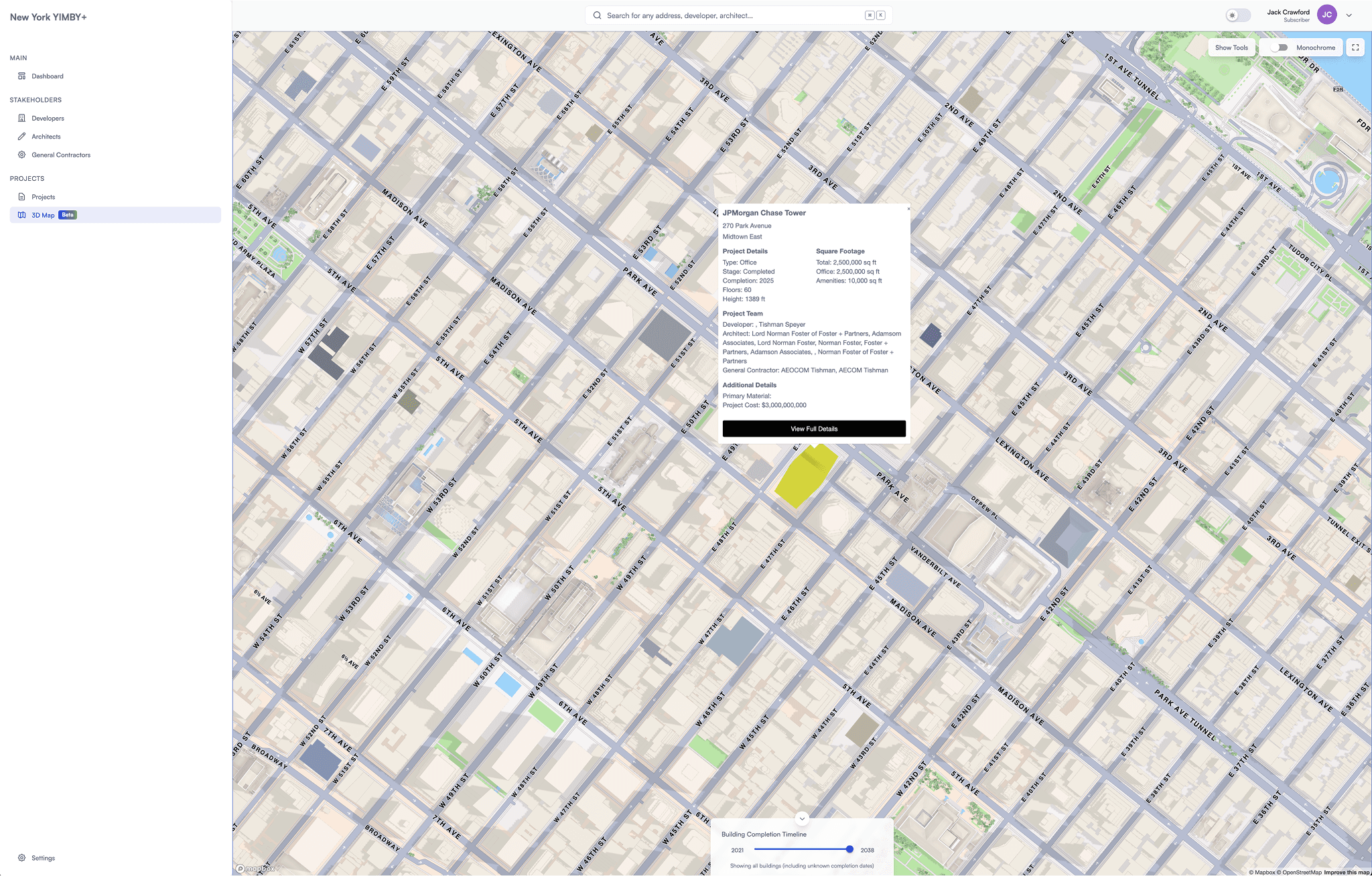
Project overview: developer, architect, height, square footage, timeline, and status
CONNECTING TO OFFICIAL SOURCES
We integrated directly with New York City's official property database (NYC DOB), pulling comprehensive regulatory data:
- Building Identification Numbers (BIN)
- Borough-Block-Lot (BBL) tax codes
- Zoning district classifications (R7-2, C6-4, M1-5, etc.)
- Community district assignments
- Fire company jurisdictions
- Lot area and building dimensions
- Owner records and assessed property values
- Certificate of Occupancy status
This transformed YIMBY+ from a visualization tool into a comprehensive research platform.
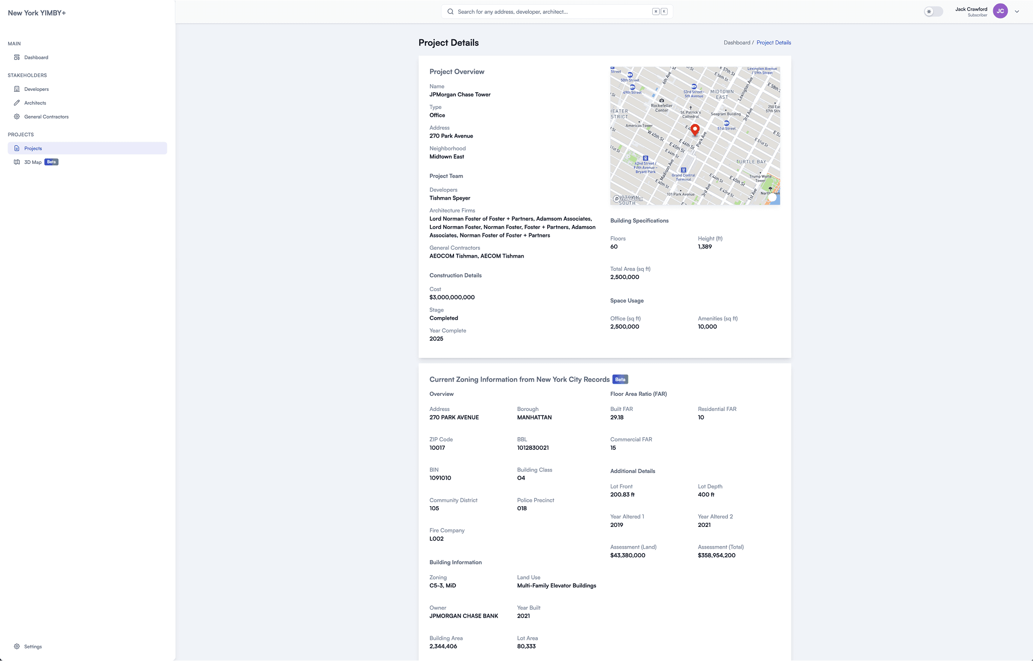
Full regulatory data from NYC records: BIN, BBL, zoning classification, community board, fire company, lot dimensions, building class, assessed value. Professional-grade data for serious research.
20 LAYERS, SIMPLE UX
As the platform matured, we refined our data layers from 19 to 20, removing redundant or problematic attributes while adding more valuable dimensions:
Removed:
- "Completion Decade" - Less granular than Completion Year
- "Neighborhood" - Geographic boundaries too inconsistent across sources
- "Primary Function" - Created confusion when Project Type already existed
Consolidated:
- "Floors" + "Stories" merged into "Number of Floors" - Eliminated metric redundancy
Added:
- "Primary Material" - Construction material data (glass, concrete, brick) for sustainability analysis
- "Total Units" - Comprehensive occupancy metrics
- Three stakeholder layers: "Developer", "Architect", and "General Contractor" - Project team accountability and portfolio tracking
The final 20 layers span physical attributes, project details, and stakeholder intelligence. But with this much dimensionality, we faced a UX challenge: how do you provide granular control without overwhelming users?
The solution: a vertical slider that lets you explore data layer values sequentially - like scrubbing through a timeline. Simple interaction, powerful results.
Interactive Data Layer Scrubber in Action
Explore Different Data Layers
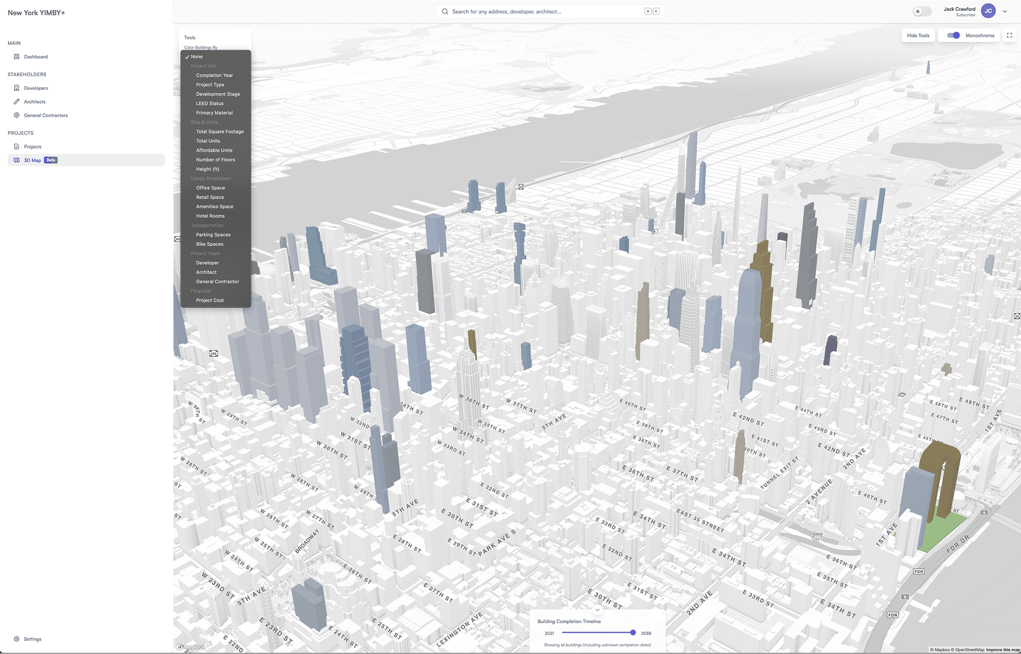
Choose from 20 data layers
Vertical slider makes complex filtering intuitive. Scrub through values like a timeline - watch the entire city update in real-time as you explore different data dimensions.
ONE PLATFORM, FOUR MODES
Different contexts demand different aesthetics:
- LIGHT + COLOR: Default mode for general browsing and exploration
- LIGHT + MONOCHROME: Focus on building form, reduce visual noise for analysis
- DARK + COLOR: Optimized for low-light environments and evening use
- DARK + MONOCHROME: Presentation mode with maximum contrast
Rather than choosing one aesthetic, we built all four - then let users switch instantly.
Light + Color
Default browsing mode
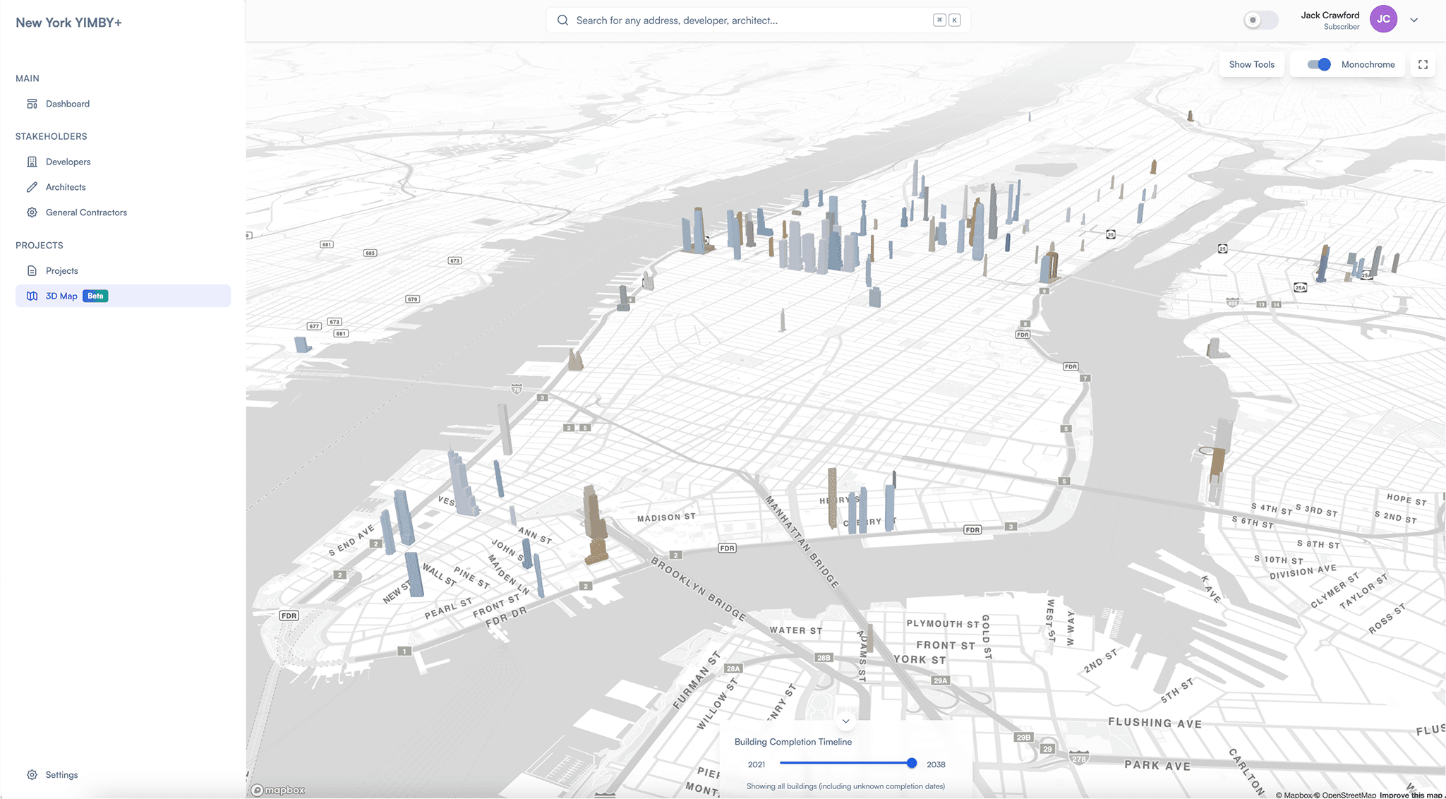
Light + Mono
Focus on building form
Dark + Color
Low-light environments
Dark + Mono
Professional presentations
Four viewing modes optimize for different contexts: casual browsing, detailed analysis, evening use, and professional presentations. Switch instantly based on your needs.
KEY INSIGHT
Enterprise features don't have to feel heavy. With careful UX design, advanced functionality can feel as intuitive as consumer products. Complexity in the system, simplicity in the interface.
HOW IT'S BUILT
A HYBRID STACK FOR COMPLEX REQUIREMENTS
YIMBY+ combines multiple technologies, each chosen for specific strengths:
3D RENDERING - Unity Engine
- High-quality visualizations for marketing and timelapse features
- Advanced camera controls and lighting systems
- WebGL deployment for browser access
WEB PLATFORM - React + Flask (Python) + PostgreSQL
- Dashboard, tables, analytics, user management
- RESTful API built with Flask and SQLAlchemy
- Client-side rendering with Vite build tool (SPA architecture)
- PostGIS extension via GeoAlchemy2 for geospatial queries
- Firebase authentication and Stripe payment processing
- Redis caching layer with RedisSearch indexing
INTERACTIVE MAPPING - Mapbox GL JS
- Web-native 3D building rendering
- GLTF custom model support
- Street-level context with familiar map UX
- Mobile-optimized performance
AI EXTRACTION - OpenAI API + Custom Validation
- GPT-4o powered text parsing and field extraction
- BeautifulSoup for web scraping article content
- Regex validation and JSON parsing from LLM responses
- Multi-source reconciliation when data conflicts
- Human-in-the-loop validation for edge cases
DATA PIPELINE:
- Ingest articles from YIMBY publications (manual URL submission via API)
- Scrape article content using BeautifulSoup
- Extract structured data via GPT-4o with field-specific prompts
- Validate against known patterns (enums for project types, stages, height ranges)
- Store in PostgreSQL with PostGIS for geospatial data
- Cache in Redis and index in RedisSearch for fast queries
- Generate user notifications for tracked projects via Firebase
DEPLOYMENT:
- Frontend: Firebase Hosting for static assets
- Backend: Docker containers (Python/Gunicorn) on AWS EC2
- Database: PostgreSQL with PostGIS (GCP-hosted)
- Cache: Redis Cloud (RedisLabs) with RedisSearch indexing
- API Structure: Three Flask services - Users, Analytics, Projects
RESULTS
BUILDING A SUSTAINABLE BUSINESS
What started as screenshots in articles became a revenue-generating platform.
BUSINESS MODEL
The platform operates on a subscription basis:
- $40/month individual access
- Annual plans with discount
- Custom enterprise pricing for institutional clients
- Affiliate revenue from real estate platform integrations
This isn't freemium - the model screenshots I included in free articles generated awareness and drove subscriptions, but the platform itself requires payment for access to interactive features and data exports.
USER BASE
- Urban enthusiasts and YIMBY advocates tracking development
- Real estate developers researching competition and market trends
- Architecture firms monitoring their market presence
- City planners analyzing neighborhood growth patterns
- Journalists covering urban development and zoning
- Academic researchers studying urbanization and policy
- Property investors evaluating emerging neighborhoods
WHAT I'D TELL MY PAST SELF
SEVEN HARD-EARNED INSIGHTS
START WITH YOUR OWN PROBLEM
The best products solve problems you deeply understand. I was writing articles daily - I knew exactly what was missing. Don't start with a solution looking for a problem.
USER FEEDBACK IS THE PRODUCT ROADMAP
Every major feature came directly from user requests: data layers, timelapse, stakeholder tracking, Mapbox integration, view modes. I couldn't have designed these in isolation. Listen obsessively.
DON'T BE PRECIOUS ABOUT TECHNOLOGY
I started with Unity because I knew it. Then learned React because web was essential. Then Mapbox because mobile mattered. The best tool is the one that solves the problem - not the one you're most comfortable with.
AESTHETICS ARE STRATEGIC
Making the tool visually appealing wasn't vanity - it increased sharing, which drove traffic, which created feedback loops, which improved the product. Beauty compounds. SimCity aesthetics weren't decoration; they were product strategy.
REVENUE VALIDATES EVERYTHING
Positive feedback feels good. Paying customers feel better. The moment people started subscribing at $40/month, everything sharpened - priorities crystallized, features got cut, quality improved. Money focuses the mind.
MULTI-CITY EXPANSION PROVES REPRODUCIBILITY
Chicago could have been a fluke. Miami confirmed it wasn't. New York validated the model worked at massive scale. Don't stop at one market when testing product-market fit.
TECHNICAL DEPTH ENABLES PRODUCT SIMPLICITY
The more sophisticated the backend (AI extraction, data reconciliation, multi-source pipelines), the simpler the frontend can be. Invest in infrastructure - it pays off in UX.
THE ROADMAP
CONTINUING THE EVOLUTION
SHORT-TERM (2025)
- • Enhanced AI extraction with GPT-5 level accuracy and lower error rates
- • Comprehensive historical data for all buildings over 200 feet (not just new)
- • Unity model v2 with performance optimizations and enhanced visual fidelity
- • Advanced export features (custom reports, API access for researchers)
MEDIUM-TERM (2026)
- • Expansion to 3 additional cities covered by YIMBY (Philadelphia, Los Angeles, San Francisco)
- • Native mobile apps for iOS and Android with offline mode
- • AI agents covering most of the data extraction and management pipeline
- • Public API with tiered access for third-party integrations
- • Neighborhood-level analytics and automated market reports
- • Time-series data tracking changes to buildings over time
- • Integration with property transaction and sales data
LONG-TERM (2027+)
- • Global platform covering 50+ major cities worldwide
- • AI agents handling full workflow and data pipeline, including automatically modeling new buildings
- • Predictive analytics for project completion likelihood
- • Virtual reality walkthroughs of future skylines
- • Enterprise white-label solutions for cities and developers
- • Open data initiative for academic research community
EXPLORE THE PLATFORM
YIMBY+ is live and growing across three cities.
WANT TO DISCUSS THIS PROJECT?
I'm happy to dive deeper into the technical architecture, design decisions, business strategy, or user research behind YIMBY+.